Web Design Best Practices to Attract More Website Visitors (2024)

Having an attractive web design is critical to a site’s success, as 38% of visitors will leave a site if it’s visually unappealing.
If you’re just starting to create websites, it might be difficult to figure out what will retain or drive visitors away.
Thus, learning about web design best practices will give you a starting point to make strategic decisions and avoid design mistakes.
In this article, we’ll provide a complete guide on the best practices to help you attract more visitors and make the most out of your site.
Download website launch checklist
Web Design Best Practices
Designing an engaging website doesn’t only require attention to aesthetics but also user experience – poor functionality leads 42% of people to leave a website. It will also lower conversion rates and increase bounce rates, affecting the site’s performance and SEO.
To help you avoid these issues, we’ll take an in-depth look at web design best practices based on the following standards:
- Branding
- Visual hierarchy
- Navigation
- Coding
- Accessibility
Branding
Branding plays an important role in web design as it shapes visitors’ perceptions of your site, helps establish credibility, and attracts potential customers. It’s especially important when you’re designing a corporate website that aims to drive conversions.
To make the process easier, we’ll go over the three main steps to ensure consistent branding when designing a website.
1. Know Your Target Audience
Identifying your audience will help you set the site’s branding and customize its design accordingly. Here are several methods to help you understand your audience:
- Audience analysis. Research your audience’s demographics and psychographics. This includes information like your audience’s age range, gender, location, socioeconomic status, interests, and lifestyle choices.
- Client interview. Invite people who have already bought your product or service to an interview. In addition to providing insights about the kind of person they are and why they chose your product, it also helps to strengthen connections with your audience.
- Competitor analysis. Take a look at your competitor’s website and social media profiles. See how they position their brand and what type of content generates more engagement.
Expert Tip
The first step in designing a new website is knowing your site’s purpose and target audience. For instance, if you’re making an eCommerce website to sell educational toys, determine who the customers will be.
You might discover that your target market is mostly first-time mothers. So, you want to appeal to this audience by using the appropriate colors, fonts, pictures, and layout on your website.

2. Build a Color Palette
While choosing a color scheme for your site seems intuitive, doing it strategically will highlight essential elements, shape your visitors’ perceptions, and prompt them to take action.
Brands that consistently use the same colors across their marketing materials have an improved brand recognition rate of up to 80%.
The website design best practices for creating an attractive color palette include:
- Explore the color theory. Before building a color palette, it’s good to know what associations specific colors may have. Next, learn the various types of color themes, such as monochromatic, triadic, analogous, and complementary, to find a good color combination for your brand.
- Don’t overlook contrast. Using highly contrasting colors improves readability and accessibility.
- Follow the 60/30/10 rule. Choose a primary color that will make up 60% of your site and a secondary color for 30%. The final 10% should use an accent color that either contrasts or complements the primary color.
- Implement complementary colors. On a long-scrolling site, consider using complementary colors such as yellow and purple to distinguish sections.
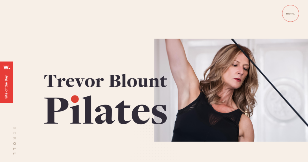
For example, the color palette on Trevor Blount Pilates’ website consists of three main colors – cream as primary, black as secondary, and red as an accent color.
This combination creates a simple yet harmonious color scheme and sets the focus on the website title and featured image.
Expert Tip
I usually start with one primary color and build color schemes accordingly.
If you’re a beginner and choose an analogous or monographic color palette, picking close shades is the easiest way. However, if you want the primary color to stand out, select a triadic color scheme or complementary colors.
Finally, add neutral colors to balance it out. For font colors, avoid using fully black (#000000) and choose a slightly lighter shade instead. Doing this will reduce eye fatigue while reading lengthy content.
3. Choose the Right Typography
A site’s typography consists of a font style, size, appearance, and structure. Choosing the right website typography doesn’t only enhance the site’s aesthetics but also optimizes user experience and accessibility.
For example, to convey serious messages and important information, pick a font style that isn’t as distracting as a more styled font.
Other web design best practices to improve your site’s typography include:
- Limit the number of font styles. Using too many styles will make your site appear unprofessional. Sticking with two visually compatible yet distinguishable font styles is better for maintaining consistency.
- Use web-safe fonts. Web-safe fonts are more likely to render as intended on different browsers and devices, keeping your branding consistent and optimizing the site’s readability.
- Set proportional text sizes. A good rule of thumb is to set your website text to a minimum size of 16 pixels or 12 pt. To experiment with text sizes and preview how they will appear on the site, use online tools like Gridlover.
- Use 50-75 characters per line. Don’t add more characters to avoid boredom and eye fatigue.
Visual Hierarchy
Strategically arranging design elements will guide visitors to important parts of the web page. Here are several factors to consider when creating a clear visual hierarchy.
1. Balance
How web designers distribute visual elements on a site’s pages determines its balance. When allocating your design elements, make sure to do it proportionately to create a sense of unity and visual appeal.
The following sections will cover the most popular design practices to make your site more balanced.
Symmetrical Design
Symmetrical design creates balance by placing elements evenly across the page’s centerline. For instance, if you have a visually heavy item on the right, you should add an equally heavy item on the left.
This type of design is quite popular as it is convenient for all screen sizes.
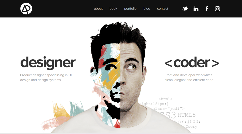
Adham Dannaway’s portfolio website is an excellent example of symmetrical design. As he makes a large caricature of himself as the focal point, the text blocks mirror each other in terms of size and position.
Asymmetrical Design
On the other hand, the arrangement of items does not follow the centerline in an asymmetrical design. To achieve balance, designers combine colors and textures or manipulate perspective.
For example, if you position a more prominent element near the centerline, it’s good to place a smaller one a bit further from it.
Check out how Mercedes Benz balances a bigger element – the model’s picture – with a smaller text block.

Mosaic Design
Unlike the other two types, a mosaic design generates a feeling of unease. This layout generally indicates motion and action, managing to draw attention with a modern and dynamic style.

2. Composition
Composition refers to the organization of website elements to give your site a cohesive structure.
A widely used framework is the rule of thirds. This method splits a design or photo into thirds using a grid of nine boxes, providing guidelines to align text, adjust objects, and generally arrange elements.
An example of this rule in practice is Hostinger’s landing page, where the elements are divided into three vertical grids.

3. Scale
During the website design process, you can use scale to bring attention to important details. Here are some web design best practices for using size differences to your advantage:
- Stick with three sizes at max. Small, medium, and large sizes are enough to give you variety while keeping a clear website hierarchy. Generally, the sizes range from 14 px to 16 px for body copy, 18 px to 22 px for subheadings, and up to 32 px for headings.
- Enlarge important elements. Pick up to two key elements to enlarge so they will stand out.
FluxAcademy’s website, for example, emphasizes the copy by using a large font.

4. Pattern
When visiting a website, people follow a particular viewing pattern to scan content. Depending on the content type, they generally follow the shape of the letters F and Z.
Designing your page layout according to these patterns will smoothen the information flow and improve the user experience. Let’s take a look at them in more detail.
Z Pattern
In the Z pattern, readers scan the page from the top left to the top right. Then, they scan down diagonally to the lower left and across the page to the lower right.
This pattern is ideal for designing pages with minimal copy and design elements, such as landing pages.
F Pattern
Meanwhile, this pattern follows an “F” shape – website visitors scan the content from the top left to the top right and repeat the process on the following lines.

Placing the most important content at the top is best to engage visitors as it is the first thing they see. This layout is a great fit for text-heavy sites like The New York Times.
5. Whitespace
Whitespace is the empty space between elements on a page. Web designers use it to break up text, direct attention to certain points, and streamline the overall user experience.
You can use color, texture, and even images as whitespace. Some web design best practices for using whitespace include:
- Use both micro and macro whitespace. Micro whitespace improves readability by putting sufficient space between words and paragraphs. Meanwhile, macro whitespace surrounds larger elements such as the website logo or headings, making the site design balanced and less cluttered.
- Be intentional. Consider whether it will enhance or interfere with surrounding elements. Too much whitespace will make your site look empty, whereas too little will make it cluttered.
6. Grouping
According to the proximity principle, people perceive items near each other as belonging to the same group. If items are grouped incorrectly, visitors will have difficulty understanding your site’s structure and where to direct their attention.
For efficient grouping, there are a few tips to keep in mind, such as:
- Combine it with whitespace. Use space to group and separate elements according to their functionality.
- Add extra elements. Borders and backgrounds act as visual cues, distinguishing or grouping elements.
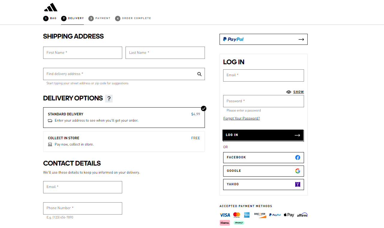
The order form on Adidas’ website is a good example of how grouping relevant information makes sorting information easier.
7. Textures
Textures are visual elements resembling a three-dimensional surface that gives contrast to your design. They reinforce the site structure, make text-heavy pages more readable, and define your brand’s tone.
For example, the Black Sheep Agency’s website uses texture to add personality and dimension to an otherwise dull solid background, tying the elements together and making the website’s design more refined.

Here are some web design practices to consider when adding texture to your site:
- Aim for simplicity. Too much texture can overwhelm visitors and divert their attention away from your content.
- Define its purpose. Use textures intentionally, whether dividing sections or highlighting images.
- Keep the text readable. Textures shouldn’t be the center of attention or overshadow important information.
8. Visuals
High-quality images and videos can make your website visually appealing and keep visitors engaged. When adding them to your site, here are website design best practices to consider:
- Feature a hero image. Displayed in the upper section of a page, a hero image provides the first impression of your brand and helps build trust with visitors.
- Use carousels carefully. Poorly designed carousels may become a distraction, reduce accessibility, or even look like ads, prompting visitors to scroll past the content. So, keep each slide simple and relevant, and allow visitors to control their flow.
- Add responsive images and videos. Responsive design ensures images are properly displayed regardless of the screen size or device. Moreover, make sure to optimize all images so they load faster.
- Pay attention to the image formats. Choosing the correct image formats can help improve your site’s performance and user experience.
Navigation
Website navigation is an important aspect of web design that helps visitors seamlessly browse your site and locate important information.
In the following sections, we’ll discuss key web design principles for navigation elements.
1. Create an Intuitive Menu
As the primary navigation element that visitors interact with, designers should aim to create intuitive and straightforward menus that ensure a smooth user experience.
Some of the popular approaches to designing a navigation menu include:
Horizontal Menu
This navigation menu appears at the top of a site as a horizontal bar that lists the primary web pages. Most websites use this navigation menu to display sections visitors expect to find, such as “About”, “Contacts”, “Products”, and “Pricing”.
Alternatively, you can list specific categories to highlight important content.
Take Wozber as an example. Their horizontal menu simply lists their products and services.

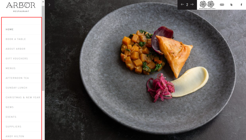
Vertical Sidebar Menu
This type of menu navigation features a sidebar containing a list of links to specific pages.
For example, the Arbor restaurant uses a scrollable vertical sidebar menu with information about the restaurant, menus, events, and booking options.
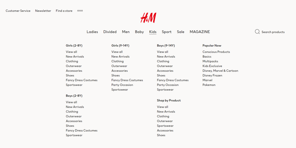
Drop-Down Menu
A drop-down menu lists all pages available after users click or hover over it. Typically used by online retailers, this type of menu is suitable for websites with many pages, as it reduces clutter while allowing easy access.
Let’s take H&M’s website as an example. Since it offers various clothing categories, it uses a top-level navigation bar to display more general items. When visitors click or hover over certain sections, a drop-down menu containing a list of more specific categories will appear.
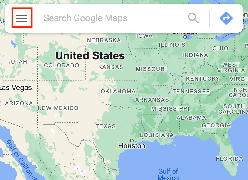
Hamburger Menu
This type of menu appears as a three-line icon. When visitors click on it, a drop-down or sidebar menu will show up to reveal the links.
A hamburger menu is a great option for mobile sites as it uses less screen space. Moreover, its widely recognized icon makes for an intuitive interface.
Google Maps is a popular application that uses this type of navigation menu.
2. Place CTAs and Buttons Strategically
The primary function of a call-to-action (CTA) is to lead visitors to take action and spend more time on your website. Whether it’s a text, image, or button, you should place it where it is easily noticeable to visitors.
Expert Tip
To create a compelling CTA, use simple, easy-to-understand, actionable words, such as “Get Started”, “Learn More”, and “Add to Cart”.
Make your CTA stand out from the rest of the content by selecting a contrasting color and using it for other clickable elements.
Finally, use whitespace to guide the visitors’ eyes and position the CTA strategically to grab attention.
In addition, consider how much effort it takes to click on the CTA button, especially on mobile devices.
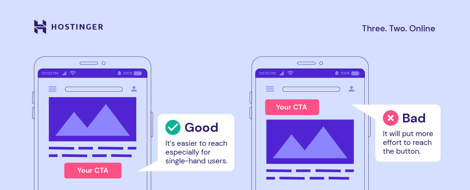
Netflix’s website is a good example of web design best practices. For instance, the “Get started” and “Sign In” CTA buttons use color contrast, scale, and whitespace to draw the visitors’ attention.

3. Add a Footer
Often, visitors scroll down to the bottom of a page expecting to find information such as contact details, the company profile, social media links, and additional products or services offered.
The elements you should include in the footer depend on your site’s goals but, overall, to keep it clear and effective, follow these web design best practices:
- Use clear language. Avoid ambiguous terms so visitors know what to expect before clicking on a link.
- Split content into categories. Define the pages you want to include and group them to make locating content easier.
- Keep its design simple and consistent. Ensure it’s readable and maintain consistent branding.
- Check for broken links. Ensure all links direct visitors to the right content.
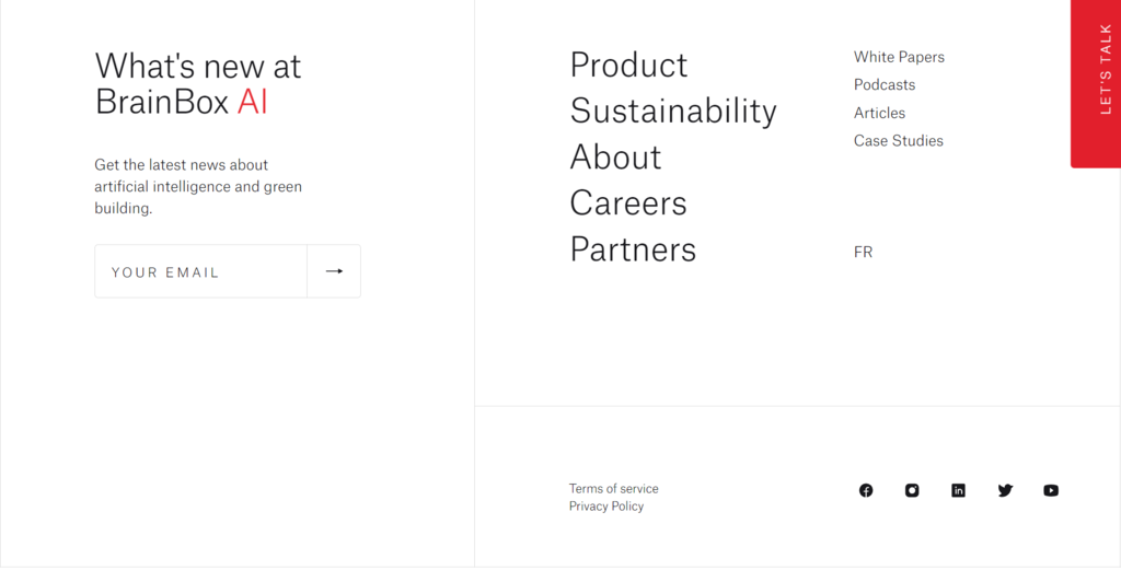
BrainBox AI’s website has a great example of a clear and effective footer. With a minimalistic design, its footer links to content not available on the main menu, such as Careers, Partners, and Articles pages.
In addition to the navigational links, it also invites visitors to sign up for its newsletter.
Coding
Once you have a well-structured and visually pleasing design, the next step is ensuring your site is discoverable on search engines, safe to visit, and runs smoothly.
In the following sections, we’ll cover several coding standards that will help you do that, including SEO, mobile-first approach, site security, and performance.
1. Boost SEO
Search engine optimization (SEO) is crucial in any digital marketing strategy. It’ll help improve your site rankings on search engine results, attracting more visitors, and increasing conversions.
You can boost your site’s SEO by following tried and tested WordPress SEO tips. Keep in mind that most recommendations are also applicable for non-WordPress sites, such as:
- Write quality meta description. An engaging description will encourage visitors to click on it, bringing more organic traffic to your site.
- Add alt texts. Describing your images with alternative text improves accessibility for people using screen readers and helps search engines like Google understand your content.
- Optimize the URL structure. Include the focus keyword in your URL slug to help search engines better locate and understand your site’s content.
In addition, implementing the following coding standards also improves your site’s SEO.
2. Use a Mobile-First Approach
50% of organic traffic comes from mobile devices, so ensure your site is mobile-friendly.
With a mobile-first approach, designers create the mobile site before moving to the desktop version. While integrating a responsive design is a good option, using this approach will give you an advantage.
It’ll be much easier to start with mobile and move on to bigger screens, as it won’t be necessary to remove elements or rework the entire design to fit smaller screens.
Here are several web design best practices for designing a mobile-friendly website:
- Put content first. Prioritize important content before adding other elements so visitors can easily find what they’re looking for.
- Make navigation intuitive. Use an intuitive menu such as a hamburger button since visitors are generally familiar with it, and it doesn’t occupy much space. Also, add a search bar to make it easy to find other content.
- Reduce disruptive pop-ups. On mobile, visitors may accidentally click a pop-up when trying to close it, causing an unpleasant user experience.
- Test your site. Use Google’s Mobile-Friendly Test or other tools to check whether your site is mobile-friendly.
HubSpot’s mobile-responsive website is a great example of this approach, with easy-to-read text, a hamburger menu, and a search bar to ensure smooth navigation.

3. Keep the Site Secure
Securing your website is essential to establish credibility and avoid data and financial losses. Even if you use a secure platform like WordPress, implementing extra website security measures will help prevent cyber threats.
- Get an SSL certificate. With an SSL certificate, data transfer between the site and its visitors will be encrypted to prevent access by unauthorized users. This helps safeguard visitors’ data, especially if your site requires them to submit sensitive information.
- Protect your login credentials. Create strong passwords and update them regularly. Keep your credentials secure using password managers such as 1Password and enabling two-factor authentication.
- Install anti-malware software. Regularly scan your entire site for malware.
- Choose a secure web host. Selecting a trustworthy hosting platform like Hostinger will strengthen your site’s security with free SSL certificates and server security features.

4. Optimize Site Performance
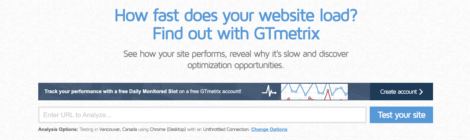
If the loading process takes longer than 3 seconds, 40% of visitors will leave the site. Hence, optimizing your site’s performance should be a priority.
To start, check your site speed with tools like GTmetrix to identify issues and get suggestions for fixing them.
Also, consider these tips when optimizing the website:
- Enable browser caching. Caching stores content in local storage, so browsers don’t need to retrieve your site’s files from the server, improving loading speed.
- Minify your code. Remove unnecessary characters and lines from your HTML, CSS, and JavaScript files.
- Set up a content delivery network (CDN). Choosing a web hosting plan with a CDN is a convenient way to improve site speed, as it delivers static content from the server closest to site visitors.
If you’re looking to simplify the design process, consider exploring no-code website design tools like Hostinger’s web page designer. It features intuitive drag-and-drop editing and numerous customization options, eliminating the need for coding expertise. Additionally, it includes a reliable hosting solution, domain, SSL certificate, and other essentials for launching a site.
Design for Accessibility
Web accessibility is another important aspect of web design, helping people with disabilities to navigate and access your content with ease.
When designing for web accessibility, follow the W3C accessibility standards, such as adding alt texts and paying attention to your site’s color contrast. For better navigation, create keyboard-accessible links.
Lastly, use testing tools endorsed by the Web Accessibility Initiative to check whether your website fits W3C’s accessibility standards.
Implementing accessibility features will improve user experience, bring more organic traffic, and boost your site’s SEO.
Expert Tip
At the last stage of your website design process, it’s good to evaluate your web design.
Consider whether it serves its purpose and whether visitors can easily scan and navigate the content. To do so, you can use an online heatmap like Hostinger Website Builder’s AI Heatmap or a quick usability testing tool like Maze.
Conclusion
Designing a website entails a lot of trial and error. However, knowing the web design best practices will give you a solid foundation when making design decisions.
In this article, we’ve covered all you need to know about designing an attractive website based on web design standards and UI/UX principles.
Keep in mind that there’s no right way to design a website – what works for one site might not work for another. The key aspect to remember is to prioritize consistency, accessibility, and user experience.We hope you found this article useful. If you’re still looking for web design inspiration, we have a list of the ten best websites to help you come up with new design ideas.

Nadya has a passion for WordPress and web hosting. She wants to help people build a successful online presence, so they can make an impact in the world. When not writing, she can be found learning new languages or orchestrating a photoshoot for her cat. Nadya is always looking to learn and grow, and she hopes to help others do the same.