How to Design a Website: 8 Steps to Creating an Effective Site Design
A well-designed website can significantly impact its success. A visually engaging and well-performing site has the potential to captivate visitors at first glance, encouraging them to explore your content and fostering a lasting relationship with your brand.
While many website owners consider hiring professional web designers, this option can be expensive. Fortunately, today’s website builders and design tools are more accessible and budget-friendly than ever, making it the perfect way to create a well-designed website yourself.
This guide will explore how to design a website without prior technical knowledge. Whether you want to sell online or build a digital portfolio, we’ll review the step-by-step instructions, essential web design principles, and some examples to help you generate creative ideas.
How to Design a Website
1. Plan your website
2. Choose a website platform
3. Customize your site
4. Set up pages
5. Optimize your site’s navigation
6. Make the website mobile-friendly
7. Test your site’s performance and launch it
8. Monitor your site and improve as you go
1. Plan Your Website
Before getting started, define why you want to create a website in the first place. This process ensures that every design decision will align with your site’s end goals.
In the case of an online store, the site design should show your brand identity and facilitate the customers’ buying journey, from product discovery to completing purchases.
Those who want to publish a portfolio website will wish for a design that complements their work.
If you need help defining the intent of your website, here are some guiding questions:
- Who is your site’s target audience?
- What are the main goals of your business’s content strategy? Is it to educate about a subject, sell products, or entertain visitors?
- What series of actions should website visitors take upon opening the site? These can include browsing your products, buying an item, reading content, or signing up for a newsletter.
- What voice and tone do you want to use to communicate with visitors? Do you want to sound professional, more laid-back, or somewhere in between?
These notes will come in handy as you build your website, so be sure to keep them in mind.
Want to know more about building a site?
Check out our best website ideas list and a guide to website essentials.
After defining your goals, look for the best web design examples to help you visualize how your future site should look like. Additionally, ensure to follow best practices for web design, such as branding and navigation.
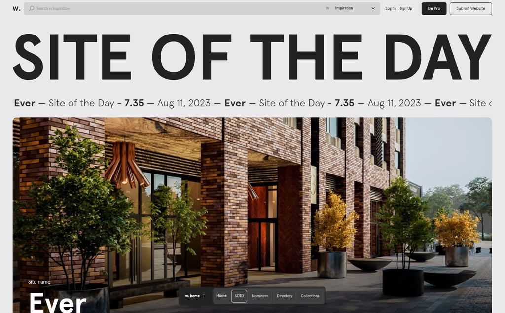
Awwwards is an excellent site for inspiration as it contains a multitude of award-winning web designs. Use the filtering options to tailor the search results to your needs.
Looking at competitor websites can also provide ideas on what visitors should expect in a business site like yours. If you don’t know who your competitors are, places like SimilarWeb can help you discover them.
Lastly, consider checking out the latest web design trends. Incorporating the newest style elements can ensure the site looks modern and up-to-date. However, remember to only apply trends to your website when they make sense.
2. Choose the Right Website Platform
To get started, choose a platform to build your site with. Ideally, you want software that suits your skill set, budget, and purpose.
One popular website platform is WordPress, a content management system (CMS). WordPress is great for creating various websites, from digital resumes and online directories to large eCommerce stores. Its robust blogging tools also make it a go-to choice for content creators.
Using WordPress requires purchasing a web hosting service. Buy basic web hosting, which should suffice for a personal or small-scale business website. For a modest website, you can try web hosting for free.
At Hostinger, our web hosting plans cost from ₱89.00/month to ₱499.00/month. All subscriptions include a 99.9% uptime guarantee, a free lifetime SSL certificate, and regular backups to keep the files safe.
Single
₱49.00/mo
Business
₱209.00/mo
If you need help choosing the right hosting plan or setting up your account, our customer service will assist you via live chat, available 24/7.
Here are only some of the excellent benefits of using WordPress:
- User-friendly. WordPress’s menu-driven interface is intuitive for users of any skill level, from beginners to professional website developers.
- Highly versatile. WordPress’s extensive collection of plugins allows for incorporating custom functionality. Divi is an example of a tool that leverages this flexibility. As both a theme and a page builder, Divi empowers users to craft unique websites using an intuitive visual interface.
- Scalable. Since users have full control over their web hosting choice, they can upgrade their plan anytime if more resources are needed to support their WordPress site.
- Affordable. Except for web hosting, WordPress is free, including many of its plugins and themes.
On the downside, WordPress has a steep learning curve. Before using the CMS, learn basic coding, especially HTML and CSS, to take your site’s look and feel to the next level.
Additionally, make sure to familiarize yourself with hosting maintenance. That way, your WordPress site will always have the most effective security features and deliver the best performance.
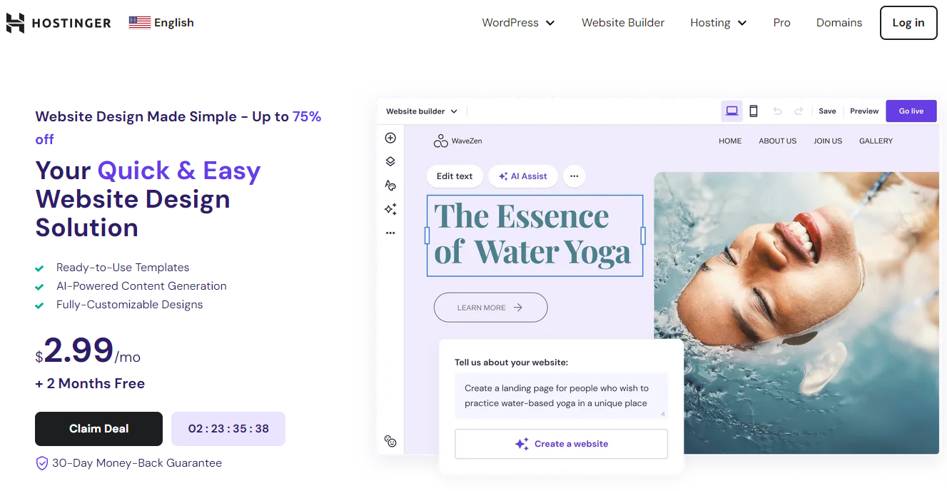
Check out a site or page builder like Hostinger Website Builder for a much more beginner-friendly solution. This website design platform offers a visual, drag-and-drop interface that allows editing and customizing without leaving the website page.
While it’s a bit more simplistic than using a CMS, you’re limited to a single website type. You can quickly build a business website, eCommerce store, blog, and online portfolio.
Below are just some of the advantages of using Hostinger Website Builder:
- Included in all of Hostinger’s web hosting plans. The site builder is included alongside all of Hostinger’s web hosting plans, meaning you can build and manage everything related to your website from a single dashboard.
- Free AI tools. Such features include logo, copy, and heatmap generators. Hostinger’s AI Content Generator is also great for creating web copy templates.
- Built-in SEO tools. Unlike WordPress, there’s no need to install a search engine optimization extension. Hostinger Website Builder lets you edit image alt text, change the page’s URL, and include metadata for search engine results pages (SERP).
- All-in-one online store features. Order tracking, inventory management, discount application, and multiple online payment options are available without extra charges. There are also no commission fees.
Check out these guides for picking the best site builder for your website:
Easiest AI Website Builder
eCommerce AI Website Builder
Free AI Website Builder
Best Personal Website Builder
After choosing your website development platform, you’ll need to get a domain name. Think of it as an address visitors will type into their web browsers to open a site. We have a separate guide explaining how to purchase a domain name if you need help.
What domain name you choose depends on your website’s purpose. Typically, people use their personal or business name as the domain.
However, these names will likely be taken, especially if they include commonly used words. In that case, consider using a domain name generator to assist you.
Don’t forget to choose a fitting domain name extension. Generally, it’s a good idea to go with the .com TLD, which is common for commercial websites. Its price starts from $8.99/year.
Opt for country code top-level domain to target a specific market. For example, registering a .us domain is a good idea if your business operates in the United States.
There are also domain name extensions made for specific types of websites. For instance, a .tech domain is excellent for tech-related projects, and .shop domains are often used for online stores.
3. Customize the Web Design
It’s time to start designing your site. Before deciding on your website’s overall characteristics, review your answers from the first step, as they will help you set up your site’s visual identity.
In addition, think about establishing your brand. This process involves:
- Choosing a web design template or theme
- Determining the website’s color scheme
- Creating a logo
- Picking the right typography options
A theme is a file containing a pre-made layout and visual elements organized and created by a web designer. It eases the web design and development process for non-technical users. In other words, they don’t have to worry about building the website from scratch.
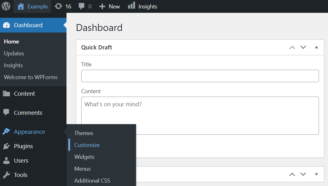
Those using WordPress as their platform can download thousands of themes for free from the official directory. Go to Dashboard → Appearance → Customize to start customizing.
Remember that your website’s customization options depend on the theme.
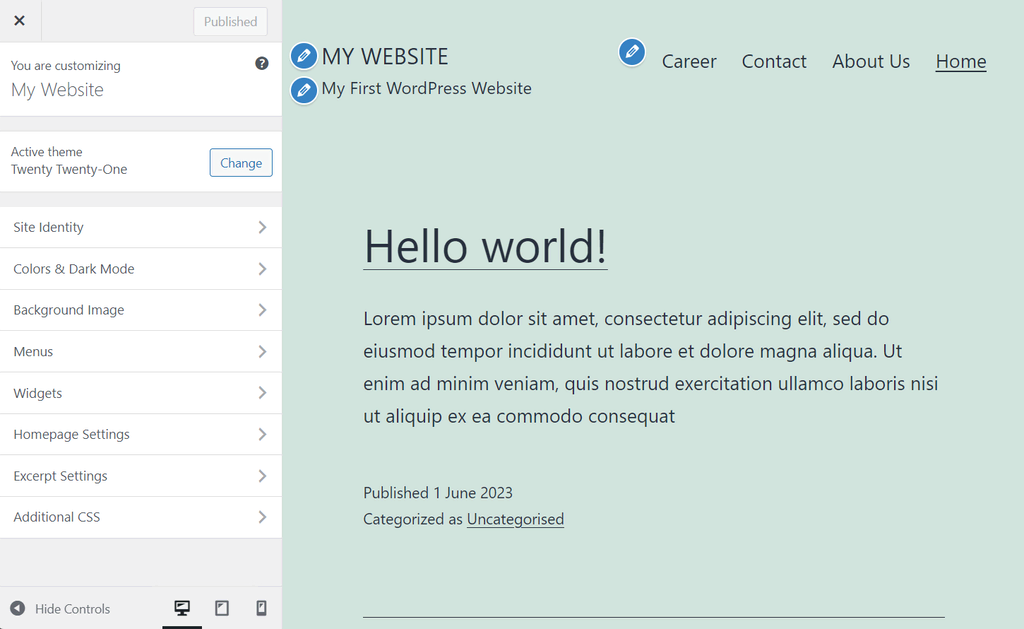
For instance, WordPress’s own Twenty Twenty-One allows editing the background color and image, but there are no built-in settings to change the font. However, it’s possible to insert custom CSS code to do this.
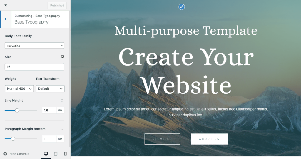
On the other hand, it’s possible to change the colors, font family, button forms, and layout using Astra’s premium theme.
If you’re using Hostinger Website Builder, go to hPanel → Websites → Edit Website. This will give you access to the drag-and-drop editor, where you can modify design styles and add new site elements.
Next, let’s talk about your website’s color scheme. First, choose a dominant color that best represents your personal or business identity.
A great way to pick a dominant color is by referring to rules of color psychology, a study of what different colors mean and what kind of feeling they can leave on a viewer.
Below is a brief explanation of what all the major colors convey:
- Red represents passion, appetite, or power. Famous brands using this color include Coca-Cola, Netflix, and Target.
- Orange is a symbol of friendliness or caution. Amazon uses this color in its logo.
- Yellow relates to clarity and youth and is commonly used to grab attention. Shell features this color prominently on its branding.
- Green is often associated with health, money, and nature. Spotify, Starbucks, and Whole Foods are some well-known brands using this color.
- Blue symbolizes security and trust. It’s a popular choice among tech brands like Facebook and Microsoft.
- Purple demonstrates royalty, wisdom, and beauty. You may find this color in candy-based brands like Cadbury and Milka.
After deciding on your dominant color, pick several additional colors to complement it.
There isn’t an exact limit to how many secondary colors you should use. However, it’s best to feature somewhere between two and three so that the dominant color remains the primary one.
It’s also good to incorporate a neutral color for the background and text elements to maintain readability.
Ritual’s website is an excellent example of a good color scheme.
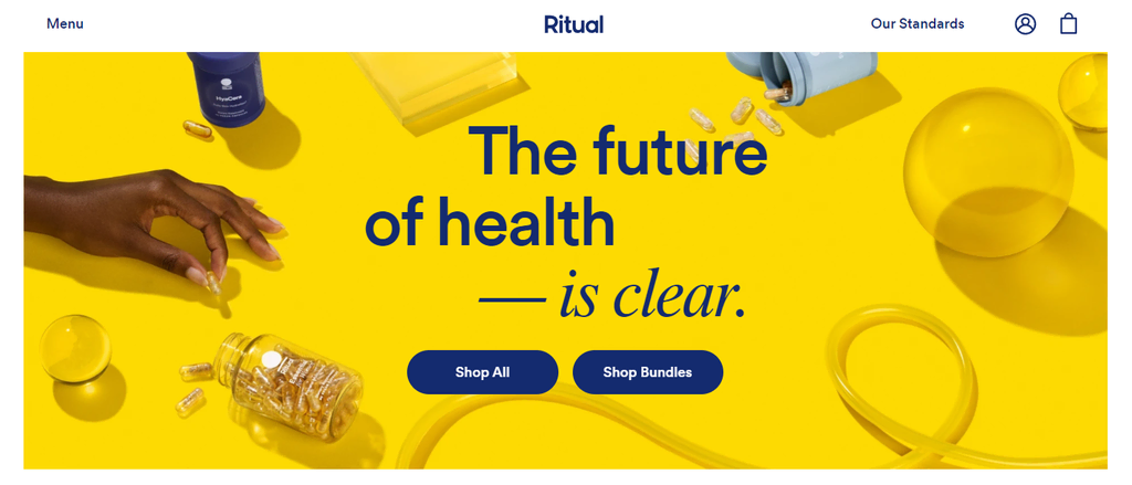
It only uses three colors, with yellow featured heavily as the brand’s signature. The white background breaks up the visual content, while the darker blue is used for copy and buttons. Such a combination results in an attention-grabbing yet pleasant design.
Those who want to colorfully design a website can follow Nippon Television Art‘s approach.
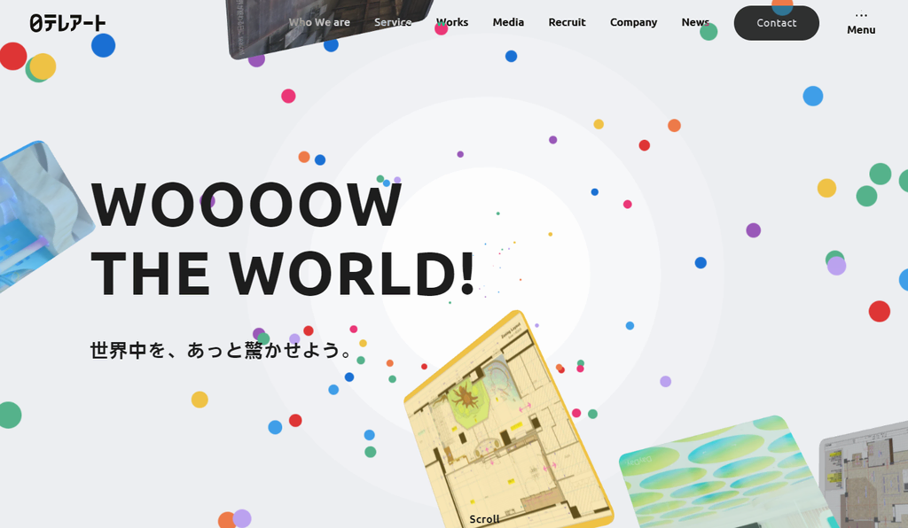
The site aims to represent the brand’s creative edge while maintaining crystal clear readability, thanks to its use of dark font.
Tools like Coolors or Paletton can help pick visually pleasing color schemes for websites of all types, so give these a try.
Now, let’s move on to logos.
A logo should represent the company’s core values, products, and services. Hence, website branding and logo design go hand in hand.
To help accelerate your logo creation process, try our AI Logo Generator.
If you’re using Hostinger Website Builder, you can access it by navigating to AI tools → Logo Maker. You’ll then be redirected to a new page.
Fill in the required information and click Start creating to get your logo ideas.
Lastly, let’s talk about typography in web design. Like the color scheme, choosing a font representing your brand’s identity is as important.
According to Canva, there are three major types of fonts:
- Serif — well-known examples include Times New Roman and Cambria. These fonts have decorative ends on their strokes, symbolizing authority and formality. Thus, they’re more popular among financial, government, or law agencies.
- Sans serif — Helvetica and Arial are popular names for this type of font. The strokes have an even width and no ends. Tech and startup brands typically use them as these fonts convey a modern approach to business decisions.
- Script — handwritten and cursive style. This font family generally symbolizes creativity or elegance. It’s more widely used among fashion, food, or beverage businesses.
You shouldn’t be afraid of combining two to three fonts in a single website. One is usually used for the headlines to communicate the brand’s key messages. Meanwhile, the rest should be used for the body paragraphs, captions, and additional information.
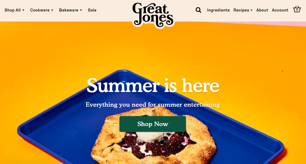
The Great Jones site is an excellent example of such a practice. It uses Cooper Black for its logo and headlines, while Hope Sans is dedicated to subheadlines, links, and quotes.
If you want to use one font type while maintaining some visual interest, vary its size and style. To illustrate how this works, let’s take a look at Black Triangle Film’s website.

Although the site only uses Bebas Neue, the design is eye-catching, making the headlines significantly larger than other elements. It also uses all uppercase letters on its call-to-action buttons, making them instantly stand out.
Check out our tutorial on using AI to design a website:
How to Design Websites With AI: Using AI to Simplify the Web Design Process + Tips
4. Set Up the Essential Pages
Generally, a site should contain the following web pages:
- Homepage
- About page
- Contact page
- Blog page
- Product or service page
To create a web page on WordPress, go to Pages → Add New on the admin panel. Here’s what the interface will look like if you use the Gutenberg editor.
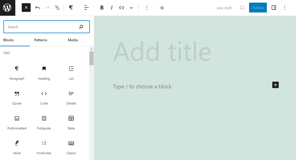
Feel free to add new blocks to populate the content of your web pages.
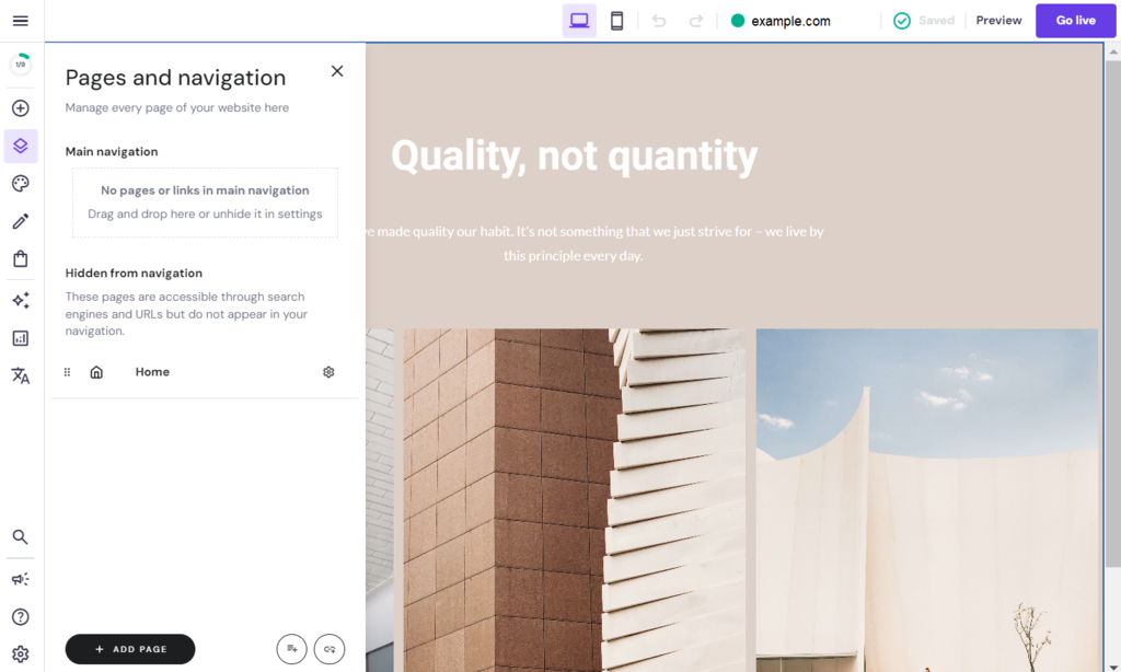
For Hostinger Website Builder users, click on the Pages and navigation icon near the top left corner. You can edit an existing page or add a new one by choosing a pre-built or blank layout.
Now, let’s explore what each web page should look and feel like.
Homepage
A homepage is typically the first page users land on. Therefore, it has to communicate what the website is about and what it aims to do. It should also create a positive first impression so the site visitor is inclined to explore the rest of the site.
One good practice for designing the homepage is focusing on the unique selling proposition. Think of it as a message communicating what makes your business unique. This tip is handy for new companies or emerging brands in a competitive market.
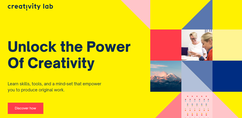
Try featuring a large headline at the top of the page and a call-to-action button to immediately capture your site visitor’s attention. Creativity Lab’s web page design is an excellent demonstration of such practice.
Those who own an online store can display a hero shot. It’s a picture or video demonstrating the uses and benefits of your products or services. Adding such imagery on the homepage can entice the audience to explore the website and discover more about its offers.
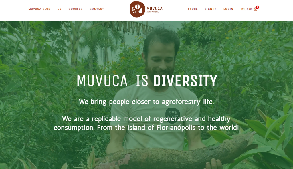
The agroforestry organization Muvuca Agroflorestal uses a full-width video banner on its homepage. Placing this element above the fold ensures it catches visitors’ attention from the very beginning.
About Page
The About page provides more in-depth information about the person or business behind the site. It’s an excellent place to tell your story, communicate your values, convey your brand identity, and establish a deeper connection with your audience.
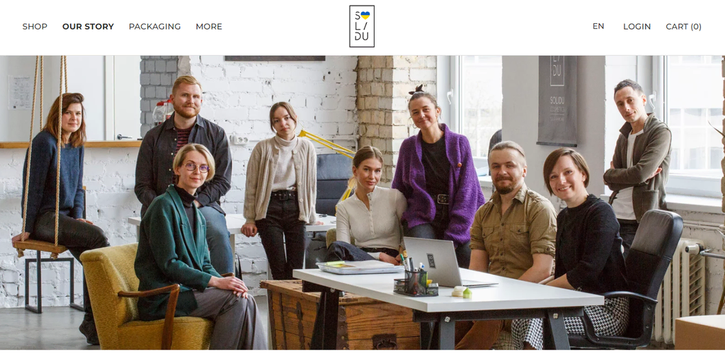
For example, Solidu Cosmetics’ Our Story page features the team’s photo, the company’s history, the brand’s USP, and an introduction video.
Additionally, including social proof on the About page is an excellent idea to cement your credibility. PooPrints does this by displaying client testimonials on its homepage.
Contact Page
This page shows site visitors how they should reach out to you. It usually includes a business phone number, email address, social media pages, and an interactive map featuring the company’s location.
Consider adding a contact form that will let visitors submit an inquiry without having to leave the site. You can do it very easily by installing a WordPress contact form plugin.
Depending on your preferences, the form will record every query submission on the website platform’s database or send it to your business email address.
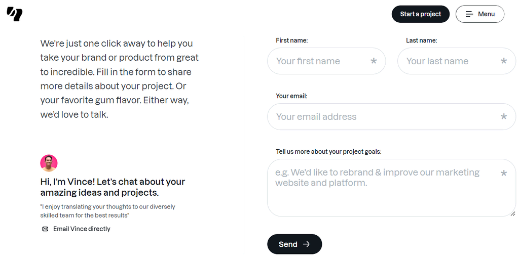
Let’s look at Yummy Gum’s contact form as a reference. The website features a project inquiry form with fields for your name, email, and project goals.
Another great example is Zendesk. The page provides two contact options, with descriptions to help visitors know which method is appropriate for their situation.
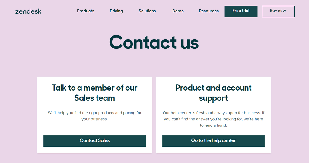
Clicking the Contact Sales button will provide a form to talk with a representative about purchasing a product. Meanwhile, the second button will lead to the help center, which is more beneficial for existing customers.
Important! As your contact form might be the primary way visitors will contact you, make it as simplistic and straightforward as possible.
Here are some tips on creating a contact page:
- Add a FAQ section. This is helpful if you get multiple questions about the same topic.
- Only include the most necessary form fields. Your inquiry’s first name, email address, and text area are essential. Asking for more information can be more time-consuming.
- Provide topic options. This will make it easy to organize your query submissions.
- Include concise instructions below the form field label. That way, users will understand how to fill in the information correctly.
Blog Page
This page only applies to content creators or businesses that use blogging as a content marketing strategy.
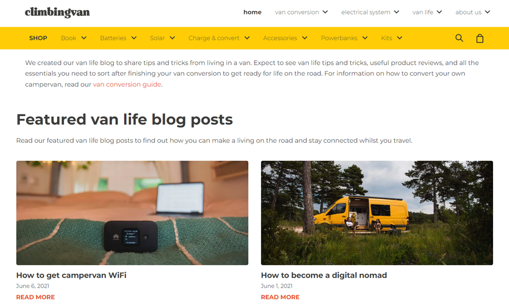
Typically, this type of page consists of featured blog posts and snippets of the blog posts in reverse chronological order. Climbing Van’s blog page is a good example of this structure.
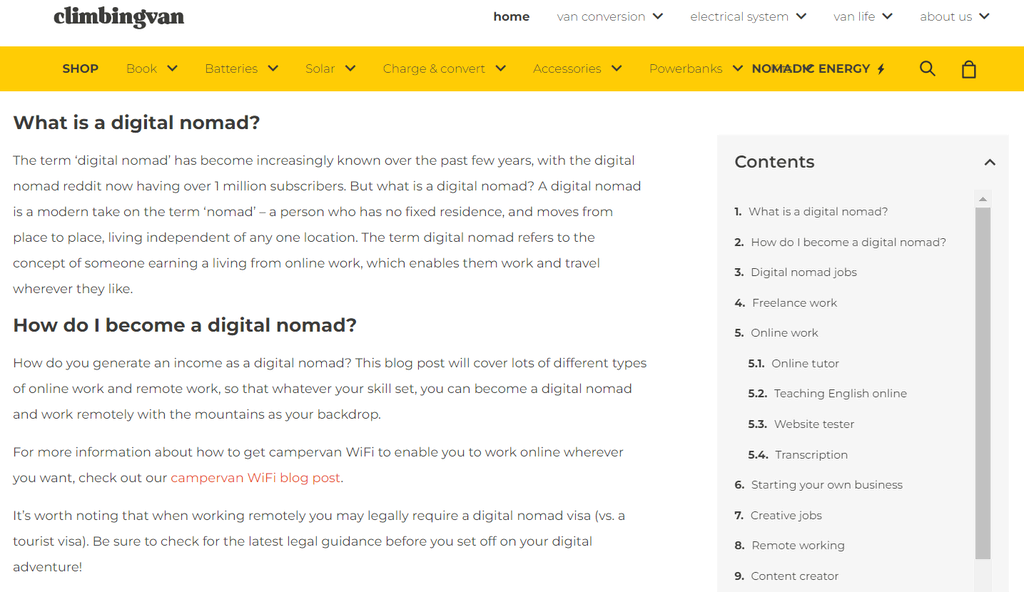
The blog post page itself displays the article on the left, while the blogger’s profile and some call-to-action buttons are on the right. It also features a table of contents to make navigation easier for readers.
Many blog websites, including Amor Pela Comida, use a grid or gallery-based layout that presents the article snippets as clickable cards.
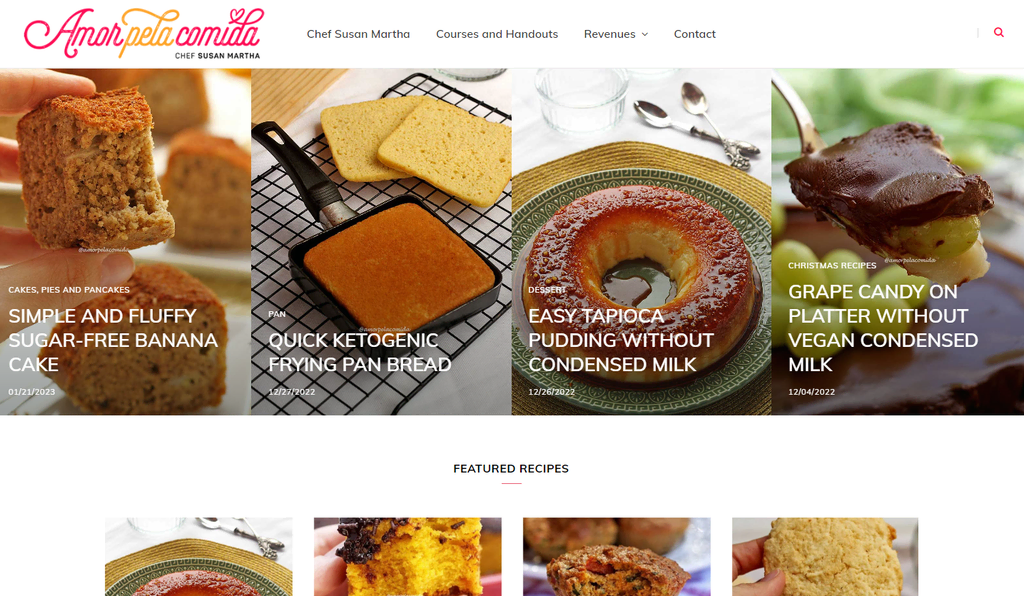
This format may be more useful for blogs with hundreds of posts in their collection. It lets readers preview multiple articles at once to decide which one suits their interest instead of scrolling through each post one by one.
On top of everything, consider using images and videos to break up your text. Aside from being visually stimulating, they help increase your blog posts’ engagement.
Product or Service Page
This page is necessary for users who run an eCommerce or business site. There are two types of pages in this category:
- Catalog page. Typically used by businesses selling multiple products or services. It displays a list of items you offer.
- Single item page. Shows every individual product or service in more detail.
What these web pages should look like depends on your products and services, so looking at your competition for ideas is ideal.
That said, here are some general tips you can follow:
- If there are multiple items, include a filtering and sorting system. This helps site visitors search for their desired products or services much quicker.
- Feature multiple photos for a demonstration. As 75% of customers rely on pictures when shopping online. Providing various product images from different angles helps increase trust and boost sales.
- Consider using a video. Give your potential customers a 360-degree view of your products by featuring high-quality videos.
- Write a compelling product or service description. Ensure to mention how it can solve your potential customer’s pain points to make the copy more persuasive.
- Display some social proof. In addition to boosting credibility, it can positively set buyers’ expectations about the item or service.
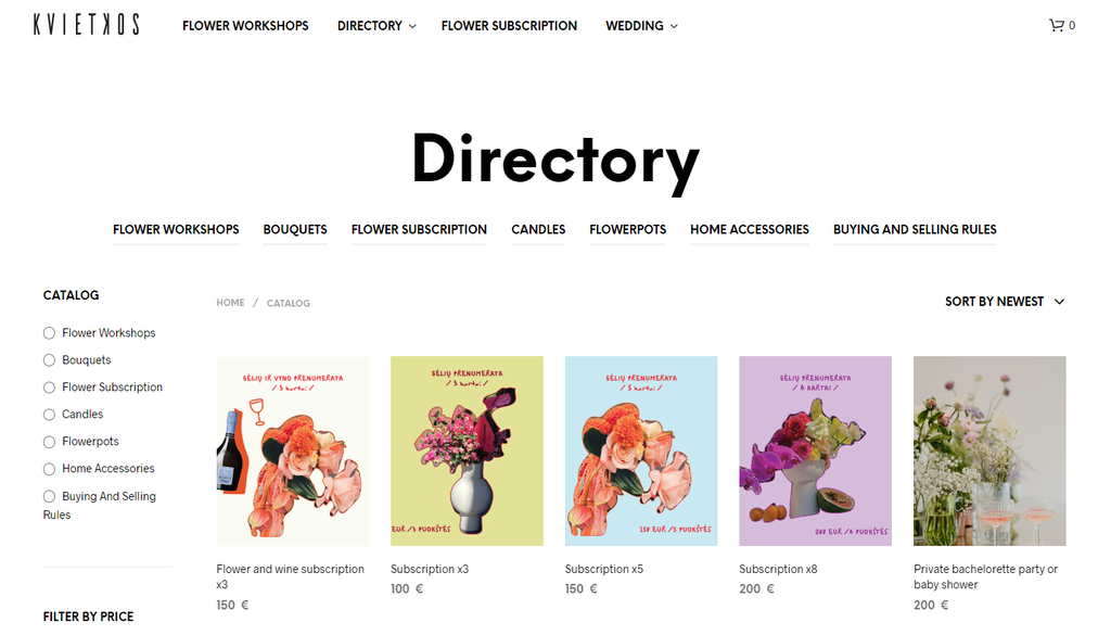
If you need references for product pages, Kvietkos is an excellent website to look at. Its Catalog page has a filtering and sorting system to narrow items by style and price.
For service businesses, take a look at Ester’s website. Its Services page includes real-life examples, making the company appear trustworthy and reliable.
Additionally, there’s an estimated project workflow to help potential clients visualize what to expect when working with the agency.
On top of everything, excellent call-to-action design increases the website conversion rate.
A CTA is a strategic prompt encouraging visitors to take specific actions aligning with the site’s goals. These include signing up for a newsletter, purchasing, sharing social media content, or starting a free trial.
CTAs are typically presented as buttons or hyperlinks with compelling, actionable text. They play a vital role in guiding users through their journey on the website.
Axiology has an excellent CTA example.
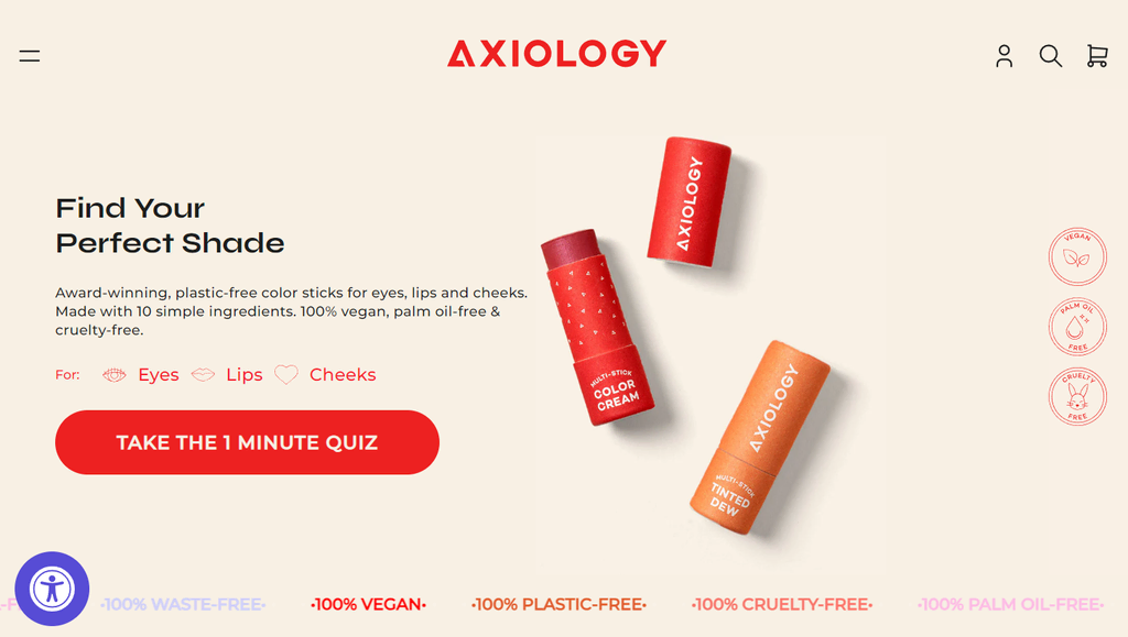
Instead of “Take the Quiz”, the vegan-based lipstick company uses “Take the 1 Minute Quiz”. This CTA provides clear direction and helps reduce decision fatigue.
By featuring well-designed CTAs, websites can effectively engage visitors, drive conversions, and achieve their desired outcomes.
5. Optimize for the User Experience
The next step is optimizing the website for better user experience (UX). Here are some important website elements to consider.
Navigation
A simple navigation system encourages visitors to explore your website’s content. That way, they can find what they’re looking for much easier, potentially boosting your site’s conversion rate.
One simple website navigation design is to use the flat site structure, meaning every page should be reachable within one or two clicks. Consequently, site visitors don’t have to open too many pages before reaching their desired destination.
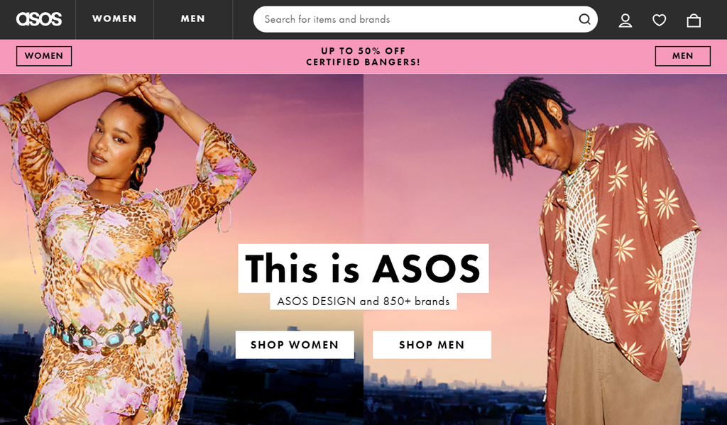
The second method is to utilize an appropriate menu design. For instance, content-heavy websites may benefit more from a mega menu, which displays an extensive list of navigation options.
Here’s an example from ASOS.
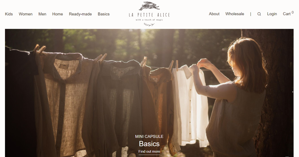
Websites with minimal content can opt for the horizontal bar. Unlike a mega menu, the horizontal bar displays only the most relevant navigation options. The rest of the pages’ links will be available on the footer.
La Petit Alice’s website is an excellent demonstration of this.
Don’t forget to add a search bar so visitors can find their desired content faster. Consider implementing a filter system to narrow down the answers.
Important! Remember to use consistent terminology throughout your website. Aside from minimizing confusion, this will help users quickly and easily find the information they seek.
Visual Hierarchy
In website design, visual hierarchy is the strategic arrangement of the page’s elements. It aims to direct users’ eyes to the essential information so they can understand the offer better and take the desired action.
One way to incorporate this strategy is by picking a layout based on a user reading pattern.
A popular example is the Z-shape format. This layout follows web users’ tendency to scan content from the top left to the top right of the page, then continue diagonally to the elements below it.
This format often alternates the text and image placements in a zig-zag pattern, like in Biennial’s site.
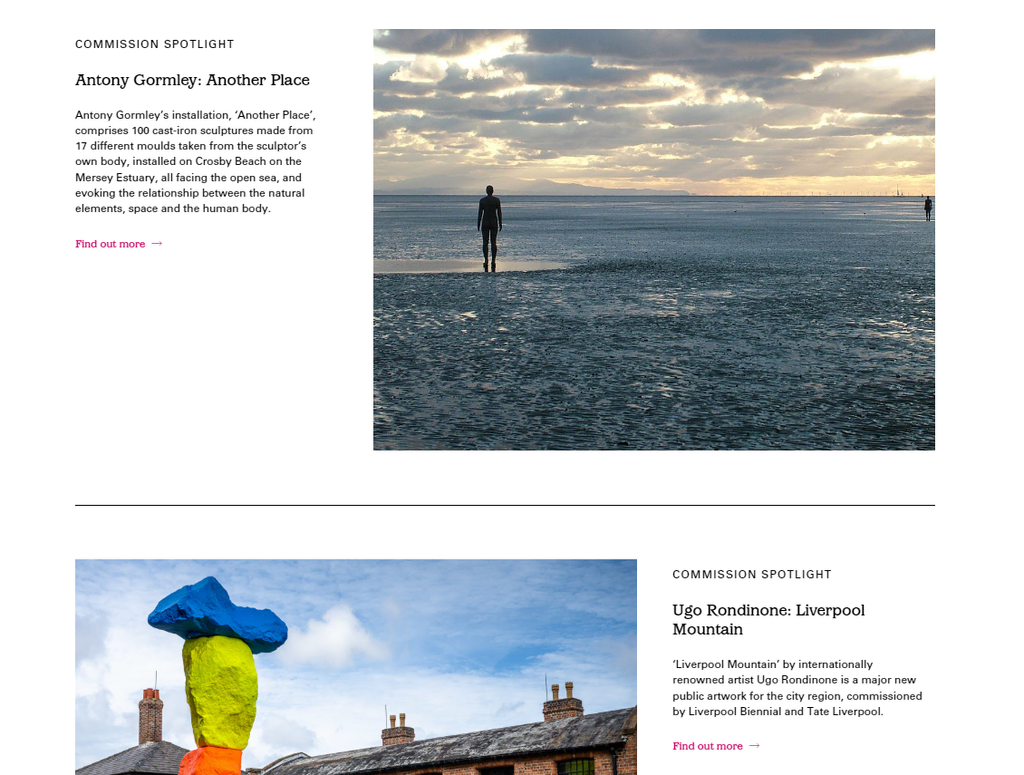
This website layout design is great for organizing long copies, making them more readable. Many website designs use it to feature multiple CTAs without overwhelming the user.
Make sure to leave some whitespace in between the page elements.
Aside from creating a sense of balance and order on the page, it’s easier for readers to identify which content to focus on. Otherwise, the website design can feel cluttered and unprofessional.
Page Speed
Site loading time is a crucial part of the overall user experience. Various reports have revealed that a slow website loading time can result in a high bounce rate, lower click-throughs, and lower chances of ranking on popular search engines.
The size of website elements can significantly impact its loading time. For instance, the website speed will likely suffer if a picture exceeds 1 MB. Google recommends that every website page should be 500 KB as the maximum.
From a web design standpoint, here’s how to improve the page loading speed.
- Optimize your media files. Use compression tools to reduce the file size. Opt for the lossless method to prevent losing image quality when optimizing web design.
- Create a minimal design. In other words, only feature the most necessary elements for the website.
- If you have access to the website files, minify them. Remove unnecessary lines, negative space, and characters with no functionality, as they add excessive weight to the code. WordPress users can manually minify CSS, HTML, and JavaScript files or use a plugin.
Accessibility
Accessibility refers to designing and developing websites or web pages to ensure equal access for people with disabilities.
The goal is to eliminate barriers that could prevent people with physical limitations from interacting with or accessing online content.
To make a website more accessible, read the WCAG first. These web content accessibility guidelines determine whether or not a website can accommodate all individuals.
Here are some ways to improve website accessibility:
- Include alt text for images. Besides being great for SEO, they’re helpful for applications that translate web content into speech or braille for the visually impaired.
- Keep keyboard accessibility in mind. Some disabilities make it difficult to use the mouse or trackpad for navigation. Ensure the TAB key is usable with every interactive element on the website, such as links, CTA buttons, and forms.
- Use readable and meaningful URLs. Ensure a link and its anchor text provide enough information about the page.
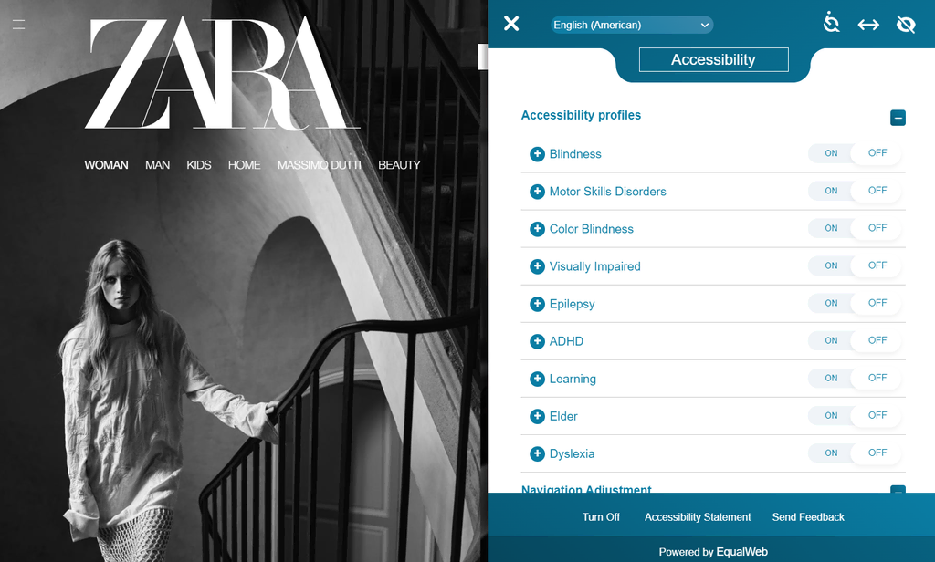
- Utilize an accessibility remediation tool. Such tools can provide all the functions needed for a website to be more usable by people with physical limitations. For example, the fashion brand ZARA uses a service by EqualWeb.
If you’re a WordPress user, check out our guide on WordPress accessibility to find out the best practices and tips.
6. Make Your Website Mobile-Friendly
Implementing a mobile-friendly website design is crucial, as half of all internet traffic originates from mobile devices. Ignoring this aspect can cost you a sizable portion of potential visitors.
Not to mention, Google considers mobile-friendliness an essential factor to rank on their SERPs.
If you use responsive web design, you’re on the right track. Below are some additional ways to make your website design more mobile-friendly:
- Use a hamburger menu for smartphone and tablet viewing. Such a menu design saves more screen space by hiding all the links under a three-lined button, usually accessible on the top left of the page.
- Make CTAs touch-friendly. The button size should be large enough for finger tapping. There should also be significant space between one button and another to prevent user errors.
- Optimize for scrolling. Use features like a sticky navigation bar, a back-to-top button, or scroll-triggered effects.
7. Test Your Website and Launch It
Before launching your website, check for any design-related issues that can affect its viewing experience. We recommend conducting website usability testing.
An easy way to do this is by asking family members, friends, or colleagues for feedback. Set up a recorded video meeting, then have them share their screen as they go through the website and comment on its visual design and functions.
Alternatively, conduct A/B testing. It’s a usability testing method where a website designer creates two versions of one site and assigns them to different user groups. By the end of the research, a web designer can compare the two variants to see which one performs better.
This technique can provide more data-driven insights into what works and what doesn’t. However, ensure to test one design element at a time so that it’s easier to pinpoint which aspect is affecting the outcome.
Using a heatmap is also an excellent idea. This tool can analyze any website and determine which sections or elements users will focus on the most. It can help optimize the web content placement to maximize conversions.
Hostinger Website Builder users can generate a heatmap by going to the AI tools → AI Heatmap. After gathering the results and making some adjustments, feel free to publish your website.
8. Track and Adjust Your Website as You Go
The last step is to keep track of the site’s performance and tweak it when necessary. This helps ensure the website functions properly and maximizes its capabilities.
Google Analytics is an excellent tool for this. It offers various website performance metrics such as:
- Pageviews. Shows how many pages a user checks out after landing on the website.
- Average session duration. This metric shows how much time a person spends on a website after visiting it for the first time. Generally, a good number to aim for is between two and three minutes.
- Conversion rate. The percentage of website visitors who perform your desired action, such as purchasing a product or signing up for an email newsletter.
- Bounce rate. Number of users who leave a site without taking any action. The benchmark for an online store is 20-45%, while on a non-eCommerce website, it should be between 35-60% of the visitors.
- Traffic sources. People may visit a site via search engines, social media, email, online ads, or referring websites. Knowing this can help determine the most effective marketing channels for attracting quality traffic to your website.
- Audience demographics. Reveals website visitors’ gender, age, and interests. Such information can help craft a more targeted marketing strategy.
Google Analytics is free and only requires your Google Account to get started. WordPress users can add the tracking ID manually to the functions.php file or use a plugin to connect the tool to their website.
Some website builders, including Hostinger Website Builder, include GA integration by default. That way, users don’t have to tweak the website’s code to enable this software.
Check out this Google Analytics 4 tutorial:
Google Analytics 4 Tutorial: Getting Started and Understanding How to Use It
What Makes an Effective Website Design
An effective website design ensures the site is achieving its purpose. For example, if you have a blog, the design should work to make the content delivery and reading experience more enjoyable for its readers.
However, every website requires different elements to make its design more effective. Here’s a roundup of the best web design practices:
- User-friendliness. All of the features and components should be accessible and easy to use.
- Organized structure. The organization of the web pages needs to be logical to ease site visitors in locating the correct information.
- Readability. The web typography, color scheme, and layout should make the content pleasant to consume.
- Aesthetic consistency. All web pages should employ the same design elements to maintain visual harmony, brand identity, and ease of use.
- Speed optimization. Every design feature must serve a function that benefits the user and the website’s purpose. There cannot be any redundancies that can otherwise impact the loading time and your search engine optimization efforts.
What Tools Can You Use to Improve Your Website Design
If you’re building your first personal or professional website, you might face budget limitations for web design services or hiring a web designer.
Fortunately, there are web design tools you can utilize to ease this process and enhance your website’s overall design:
- Icon or illustration packs. They’re great for making any website more visually appealing. DrawKit and Ouch have several free selections for various industry categories. You can also try design marketplaces, like Fiverr or Upwork.
- Stock photos. Choose photos featuring human faces, as they help build trust when appropriately used. Unsplash is an excellent place to look for such images for free. Make sure to pick only high-quality pictures.
- Page builder plugin. This tool is for WordPress users who want to incorporate a drag-and-drop site builder in the CMS. A well-known example is Elementor and Beaver Builder.
- Logo maker. Consider this tool if you haven’t developed a branding strategy for your business yet. Online logo makers can generate a professional-looking logo in minutes.
- Canva. This freemium design software is excellent for making website banners and featured images. It’s also great for last-minute photo editing and social media marketing content.
Conclusion
A good site design should focus on user-friendliness, organized structure, readability, aesthetic consistency, and speed optimization. Consequently, it significantly influences a site’s growth and success.
Here’s a short recap on how to design a website:
- Plan your website. You’ll need to define your goals and visualize the design.
- Choose the right platform. Content management systems and site builders are two popular options. Choose the latter for the more beginner-friendly solution.
- Customize your design. Consider the theme, color scheme, logo, and typography.
- Set up essential web pages. These should include the homepage, About Us page, contact form, blog, and product or service pages.
- Optimize for the user experience. Carefully plan your website’s navigation, visual hierarchy, page speed, and accessibility.
- Make your website responsive. Besides improving mobile user experience, responsiveness is also a major ranking factor for Google.
- Test and launch your website. Ensure your site is free from design-related issues before publishing.
- Conduct regular tracking. This process helps ensure optimal website performance.
We hope this article has been helpful. If you still have any questions, please feel free to reach out in the comments below.
Learn More About Website Creation
Check out our top picks for drag-and-drop website builders that make creating a professional-looking site a breeze.
How to Design a Website FAQs
Here are some of the most frequently asked questions about how to design a website.
Why Is Web Design Important?
Web design is a crucial step of website building as it directly impacts user experience and influences how site visitors perceive your brand. An effective website design should improve user engagement, boost conversions, and establish credibility. It can also help businesses achieve their objectives, such as increasing brand awareness, attracting traffic, generating leads, and boosting sales.
Can I Design a Website as a Beginner?
Yes, you can design a website as a beginner. Some user-friendly site builders, including Hostinger Website Builder, make it easier to build a professional-looking website without coding knowledge. Website builders typically offer templates and features you can tweak to fit your needs.
What Are Some Website Design Trends?
Some current web design trends include minimalistic and clean layouts, bold typography, dark mode options, asymmetrical designs, video backgrounds, and immersive scrolling effects. However, trends can vary, so it’s important to consider your brand identity and user experience when incorporating design elements.
How Much Does It Cost to Design a Website?
The cost to design a website varies based on factors like the design complexity, the number of pages, and the features required. Generally, its prices range from a few hundred to several thousand dollars. This depends on your needs and whether you hire a professional designer or use a site builder.

Maisha is a proponent of high-quality, actionable content. When she's not writing for Hostinger Tutorials and Blog, she immerses herself in the English thesaurus. Her love for personal development essays drives her to help her fellow writers succeed in the world of content marketing.

Linda is a seasoned Content Writer specialized in website creation. With her passion for the written world and obsession with helping others, her goal is to deliver resourceful content pieces for all skill levels. When she’s not writing, Linda likes to cross stitch and watch films. Follow her on LinkedIn.

Comments
October 28 2023
The information in this blog about website designing is very useful and informative. It gives accurate information. It provides good services about website designing. Thanks for this useful information. I like this blog. This information is very helpful.
November 07 2023
Hi there! Thank you for your kind words. If you have any more questions or need further assistance, feel free to ask! ?