Website Navigation: Different Navigation Types, Tips, and Examples
Good website navigation ensures a positive user experience. It helps your visitors find the information they seek more easily, leading to higher dwell times and lower bounce rates.
Google and other search engines also favor websites with clear, intuitive navigation systems since they make it easy for search engine bots to crawl the web pages and index their content. Properly indexed websites have higher search engine rankings, leading to more visits.
In this article, we’ll go over the best website navigation practices. We’ll also cover various navigation types and provide examples to give inspiration for your website menu design.
Download website launch checklist
What Is Website Navigation?
Website navigation is a set of user interface elements like menus, search bars, link text, and buttons that help visitors explore the website. Besides browsing, navigation helps visitors understand the relationship between individual web pages.
Among the various user interface components that enable website navigation, menus stand out as the most crucial. For this reason, we’ll start with them.
What Is a Website Navigation Menu?
A navigation menu is an organized set of links to a website’s internal pages. Menus are typically located in the header or sidebar section of a website.
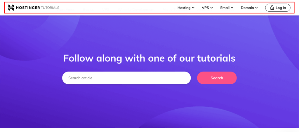
At Hostinger, for example, we feature our navigation menu at the top.

Typically, these menus include links to essential pages, such as About Us, Products, Features, and Pricing.
Website Navigation Types
There are four main types of website navigation that you should implement when designing your website. Each type has a defined role and uses different UI elements to provide different ways for visitors to move around your site.
Global Navigation
Global navigation refers to the website layout section that is reserved for a primary menu. The primary navigational menus, or main menus, are consistent across all internal website pages. They provide visitors with a constant, accessible guide to the site’s core areas.
Here are some key features of global navigation:
- Fixed position – global navigation remains fixed at the top of every page as a header navigation bar.
- Limited navigation links – they only contain clickable links to the main website pages, avoiding clutter and confusion.
- Consistent look – this area will have the same appearance throughout the website.
Many modern primary menus are designed to be global, including Hostinger’s. The accompanying screenshot illustrates our header menu, which has a uniform look across all core pages.
Local Navigation
Local navigation complements global navigation by creating a more detailed site structure, where you can organize multiple pages under specific sections, often as a dropdown menu.
This navigation type is common across websites that offer multiple services and host extensive content, like an educational platform or an eCommerce site, where detailed categorization is necessary.
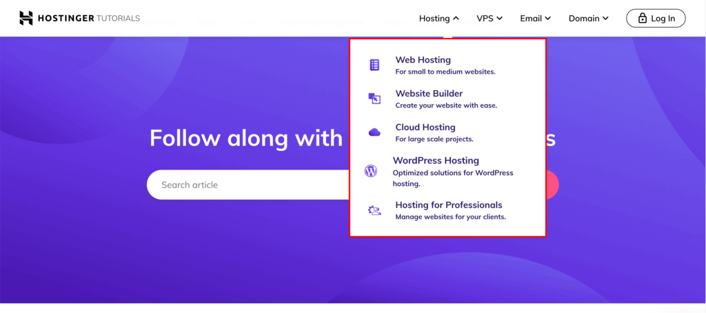
Hostinger effectively utilizes local navigation within its global menu to streamline visitor access. Under the Hosting category, users can easily find a dropdown menu that lets them explore the diverse range of hosting services we offer.
Supplemental Navigation
Supplemental navigation provides additional options that go beyond the global and local structures. It offers contextual guidance and suggestions to nudge further exploration.
This type of navigation includes:
- Guides – valuable resources that help familiarize new users with a website’s content and features. Guides can come in different forms, including interactive tours, step-by-step instructions, and micro-portals.
- Breadcrumb navigation – shows users their current location within the website.
- Search functionality – a key component of supplemental navigation that enables users to quickly find a specific page or content by entering keywords.
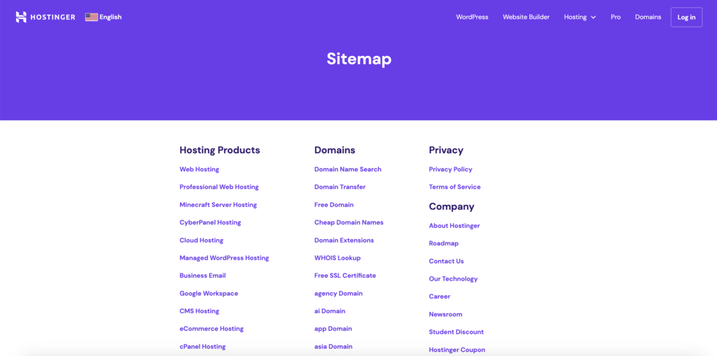
- Utility links – provide quick access to other non-essential site features, like links to user accounts, contact pages, social media icons, sitemaps, privacy policies, and help or support sections.
- Sitemaps and indexes – offer a bird’s-eye view of the website’s structure, helping users find content more efficiently.
Contextual Navigation
Contextual navigation plays a key role in enhancing user engagement by guiding users to different pages of the website that are related to the one they’re currently viewing.
It often takes the form of internal links embedded within the content, leading to related articles or product recommendations.
This approach improves the user experience and supports search engine optimization (SEO) efforts by encouraging visitors to explore more content and spend more time on the site.
Website Navigation Best Practices
Besides getting visitors from point A to point B, effective website navigation creates a seamless browsing experience through an intuitive UX design.
Let’s delve into the best practices for website navigation.
1. Prioritize Clarity and Simplicity
A clear and simple navigation structure ensures that visitors can effortlessly find what they need. The quicker they can find the page they want, the higher their engagement and satisfaction will be.
To achieve this, consider the following when designing your site’s navigation menu:
- Intuitive UI – make your navigation menu straightforward and user-friendly.
- Make it sticky – implement a sticky navigation menu to provide quick and effortless access.
- Limit menu items – don’t overcrowd the main website navigation bar with too many links. Use local and supplemental navigation to avoid clutter.
Achieving clarity and simplicity in your website design is easy with the right tools. Hostinger Website Builder comes with pre-built templates, an intuitive drag-and-drop interface, and versatile customization options that streamline the web design process.
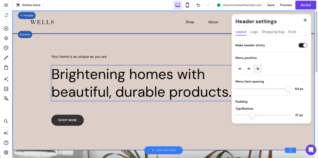
The platform makes it easy for you to implement the discussed pointers with just a few clicks. You can do complex design tasks, such as making the header sticky, without any coding knowledge.

2. Use Descriptive Labels
Labels should clearly communicate the content or function of the link, making it easier for users to navigate your site.
Here are some key points to consider when creating descriptive labels:
- Avoid jargon and ambiguity – steer clear of technical and ambiguous terms that might confuse the visitors. The goal is to make your website accessible and understandable to all users, regardless of their background or expertise.
- Conduct user testing – regular user testing can be invaluable. It helps ensure that your navigation labels resonate well with your target audience.
- Avoid formatted labels – labels with excessive styling or complex icons can distract or confuse users. Stick to simple, text-based labels for clarity and ease of use.
3. Organize Content Thoughtfully
Arrange your website navigation structure in a logical manner to help users understand the structure of your site and find information more efficiently.
For instance, if you’re making a website from scratch for a digital marketing agency, its main menu links might be Services, About Us, Blog, and Contact.
Once you identify the main categories, you can group related content under them to create a simple hierarchy. For instance, under Services, you could have subcategories like Search Engine Optimization, Content Marketing, and Social Media Management. You can show the subcategories using a dropdown navigation menu.
Dropdown menus are great for building website hierarchy as they help you organize subcategories without cluttering the main navigation bar.
However, avoid overly deep nesting of subcategories as it can confuse users. You can do this by grouping your content such that a main category only needs a single level of dropdown to take visitors to the various pages listed under it.
If you cannot find the right category for a web page or site feature, you can list it as a non-essential link in the footer menu.
4. Ensure Mobile Responsiveness
Websites not optimized for mobile devices risk causing user frustration and potentially higher bounce rates.
You can make your site mobile-friendly using:
- Mobile-first approach – start your design process by considering mobile devices. Establish a user-friendly navigation for smaller screens, then move on to designing for larger screens. This ensures intuitive and accessible navigation across all devices.
- Responsive design principles – use flexible website layouts, scalable images, and responsive navigation menus to ensure your mobile site looks and functions well.
- Mobile navigation elements – mobile-specific design elements, such as the hamburger navigation menu to simplify navigation on smaller screens.
These strategies are seamlessly integrated into Hostinger Website Builder. Our templates are designed using a mobile-first approach and use responsive UI elements.
You can easily switch to the builder’s mobile device view to customize how your site will look on a smaller screen.
All web design elements in our templates, such as the layout, website toolbars, and images, are fully mobile responsive. The website also automatically switches to a mobile menu when loaded on a small screen.
5. Highlight Important Components
Identifying and emphasizing the most crucial elements of your website’s navigation is key to guiding users effectively.
Here are some tips to help you highlight these components:
- Prioritize key elements – determine which aspects of your site are most valuable to your audience. This could be your product page, contact information, or special offers. Place these elements prominently in your navigation menu.
- Use visual cues – employ different colors, fonts, or icons to make these key elements stand out. For instance, a Contact Us button can have a contrasting color to draw attention.
- Strategic placement – position important items where users are most likely to look first, such as the top-left corner of the menu or the center of a top navigation bar.
- Consistent highlighting – make sure to highlight the navigation icons consistently across all pages, so users can easily find them no matter where they are on your site.
6. Monitor Analytics
Gaining insights into user behavior is key to refining your website’s navigation. This approach ensures that your site’s navigational structure aligns more effectively with user needs and preferences.
Here’s how you can leverage analytics to enhance navigation:
- Use analytical tools – like Google Analytics to gain comprehensive insights into user interactions with your navigation menu. Track clickstream data to identify frequently accessed menu items and potential areas of friction.
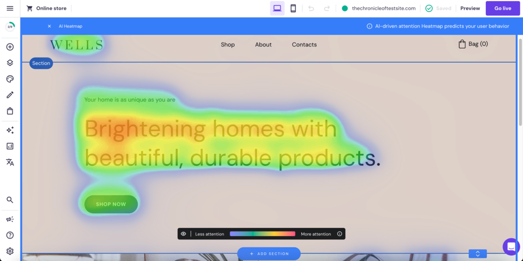
- Analyze heatmaps – using tools like Hotjar to generate a visual representation of where users click, hover, and scroll. This offers valuable insights into how they engage with your site navigation.
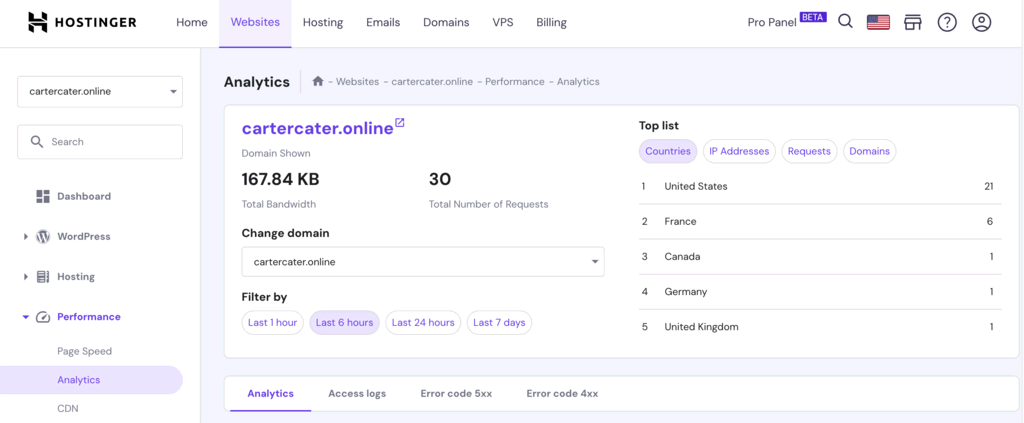
Hostinger makes it easy for you to incorporate analytics into your website design process. hPanel, our custom-built control panel, comes integrated with performance analytics features, allowing you to monitor key metrics directly.
Additionally, Hostinger Website Builder includes an AI Heatmap tool that provides builders with visual insights into user engagement, enabling data-driven design decisions.
7. Use a Clear Visual Hierarchy
Establish a visual hierarchy in your web design to highlight important pages and organize secondary content. This web design practice helps users navigate your site easily without feeling overwhelmed.
Here’s how to achieve this:
- Prioritize top-level links – position the most crucial links at the top of your main menu. These should directly correspond to the primary actions or information website visitors seek, such as Products, Services, or About Us.
- Strategically place secondary links – allocate less critical links to areas like the footer navigation menu. These might include FAQs, Blog, or Contact Us. This placement ensures they are accessible but don’t overshadow your main offers.
- Balance visibility and accessibility – ensure that your navigation structure balances the visibility of primary links with the accessibility of secondary information. This creates a user-friendly site experience that intuitively guides visitors.
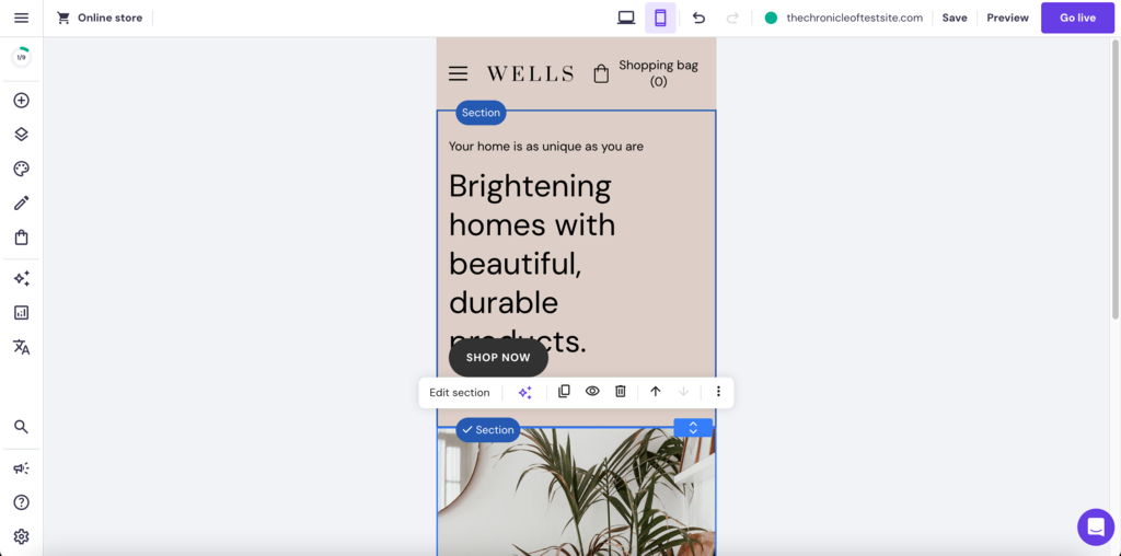
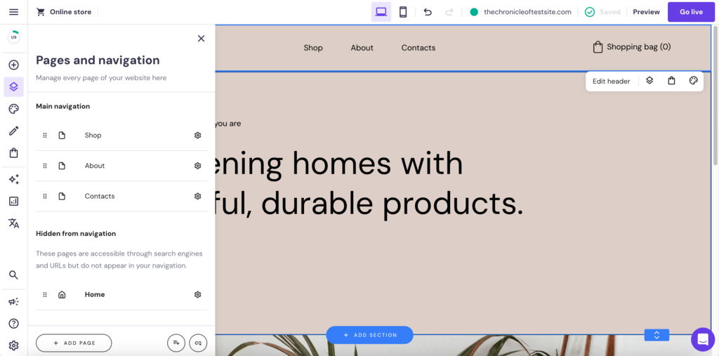
Hostinger Website Builder can help you implement site hierarchy with ease. Users can easily customize the main page navigation menu through the Pages and navigation option. You can also add new pages or create subcategories for a menu item.
8. Include a Search Bar
Incorporating a search bar into your website navigation menu enables visitors to find information quicker than through traditional navigation paths.
Here are a few key factors to consider:
- Search bar location – place your search bar in the header or near the main navigation menu to give users easy access to it.
- Intuitive design – the search bar should be intuitive and straightforward. A simple magnifying glass icon is universally recognized and can be accompanied by a clear label like Search for added clarity.
- Advanced search features – consider implementing advanced search features such as auto-complete, filters, and sorting to enhance the search experience further.
9. Consider Accessibility
Prioritizing accessibility in navigation is essential for creating an inclusive browsing experience.
Here’s how you can make your website more accessible for better navigation usability:
- Keyboard navigation – ensure that visitors can access the navigational elements through their keyboard. This includes having a logical tab order and keyboard-accessible links, buttons, and form controls.
- Contrast and legibility – use high-contrast colors for text and background in your navigation menus to ensure legibility for users with visual impairments. Large, readable fonts also contribute to better accessibility.
Apart from these, here are some advanced steps to optimize your website for better accessibility:
- Semantic HTML – utilize semantic HTML elements like <nav>, <header>, <footer>, and <main> in your HTML code. This helps screen readers and other assistive technologies understand the layout and purpose of different sections, making navigation more intuitive.
- ARIA roles – implement ARIA (Accessible Rich Internet Applications) roles to enhance the accessibility of your website. These roles define the type and purpose of web elements, aiding assistive technologies in conveying this information to users with disabilities.
Website Navigation Examples
There are different types of website menus that cater to various design needs. Each type offers unique functionality and layouts, helping guide visitors through your site effectively.
To illustrate this, let’s explore five diverse website navigation examples, each showcasing unique features and styles:
Alibaba
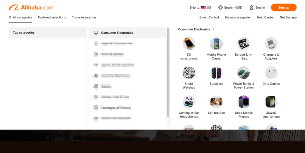
Alibaba uses a navigation system that organizes its content thoughtfully using mega menus. Despite the variety of products it sells through its platform, its mega menu only requires two levels of nesting, one to list the subcategories and one to list the products under them.
The platform also makes the hierarchy less challenging to navigate by using an overlay menu and adding illustrated descriptions at the final level.
Airbnb
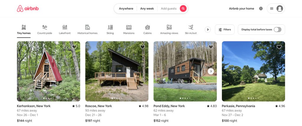
Airbnb uses a minimalist approach, focusing on a clean and simple horizontal navigation menu. The layout prioritizes simplicity and clarity by only providing three options in its main menu – Anywhere, Any week, and Add guests. All three navigation buttons have their own overlay menus that expand on click.
The New York Times
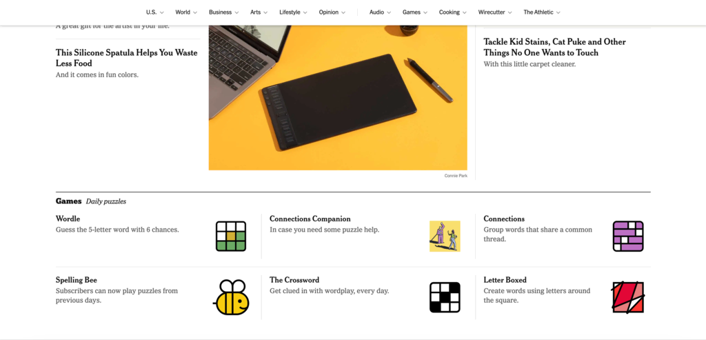
The New York Times features a sticky horizontal navigation bar to keep the navigation options readily available for the users. The key news categories each come with their own dropdown menus to help visitors navigate to the subcategories.
Sticky navigation significantly improves user experience on one page or content-rich sites with extensive scrolling.
YouTube
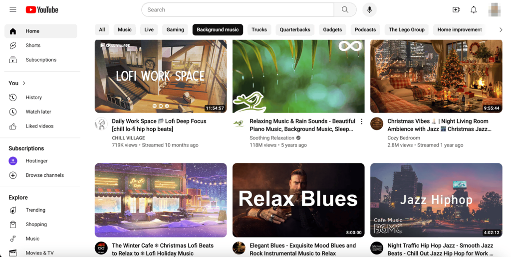
The desktop YouTube version combines a vertical sidebar navigation menu with a hamburger menu. This hybrid mega menu offers quick access to essential features like Home, Shorts, and Subscriptions when collapsed.
Visitors can expand it by clicking on the hamburger navigation button to open a vertical sidebar menu for additional options.
NKI

French visual effects studio NKI breaks away from traditional website layouts by employing a full-screen grid-based navigation system. Users can browse the website by just moving their mouse around the screen.
This game-like exploration approach reflects the studio’s personality. The website also features a fixed menu in the bottom left corner, offering a stable point of reference for better accessibility.
Conclusion
Effective website navigation creates intuitive paths users take to move around the website, improving your user experience and satisfaction.
We recommend starting with these four best practices when optimizing your website navigation:
- Clarity and simplicity – aim for straightforward navigation with clear labels. This helps users find what they need quickly and without confusion.
- Mobile responsiveness – adapt your navigation for various screen sizes to ensure a consistent experience across all devices.
- Descriptive labels – write easily understandable and relevant labels for your menu items, avoiding technical jargon.
- Logical hierarchy – place the most important links prominently in your primary navigation and organize content logically.
Remember, navigation is an evolving aspect of web design. Keep up with emerging trends and user behaviors to meet current needs. Good luck!
Website Navigation FAQ
Let’s address some frequently asked questions about website navigation.
Why Is Website Navigation Important?
Effective website navigation ensures that users find what they need quickly and easily, enhancing their overall experience and satisfaction. It’s crucial for usability and helps retain visitors, directly impacting the site’s success.
What Makes a Good Website Navigation?
Effective website navigation is intuitive, simple, and consistent, ensuring users can find what they are looking for effortlessly. The cornerstone of this seamless guidance is a well-organized menu and a logical site structure, which work together to eliminate confusion and clutter.
How Do I Choose the Right Navigation Type for My Website?
To choose the right navigation type for your website, consider its size and content complexity, your target audience’s preferences, and ensure mobile responsiveness. Opt for simpler navigation for smaller sites and more comprehensive structures for larger ones. Conduct user testing to get valuable insights for the final decision.

Akshay is a Senior Content Writer who loves writing about technology. As a Computer Engineering graduate and a certified digital marketer, he aims to make tech easier for everyone. He also enjoys cooking, traveling, and learning new languages. Follow him on LinkedIn.