25 Examples of eCommerce Websites With Fantastic Designs for 2024

eCommerce websites have become an integral part of any business’ success. The increase in online sales during the pandemic saw business owners moving from physical storefronts to digital solutions to sell online, helping to expand their reach and increase revenue.
Whether you’re a beginner or already have a physical store, creating an eCommerce site requires careful attention to design, aesthetics, navigation, and accessibility. These elements are vital for leaving a lasting impression and delivering a smooth shopping experience.
To help you build an eCommerce site that stands out, this article lists 25 eCommerce websites with excellent designs and functionality for inspiration. We also list six crucial eCommerce design aspects as a starting point for your online selling journey.
Download Checklist: How to Start an Online Business
The 25 Best eCommerce Websites
These are the most popular eCommerce website examples out there:
1. Zulu Longines
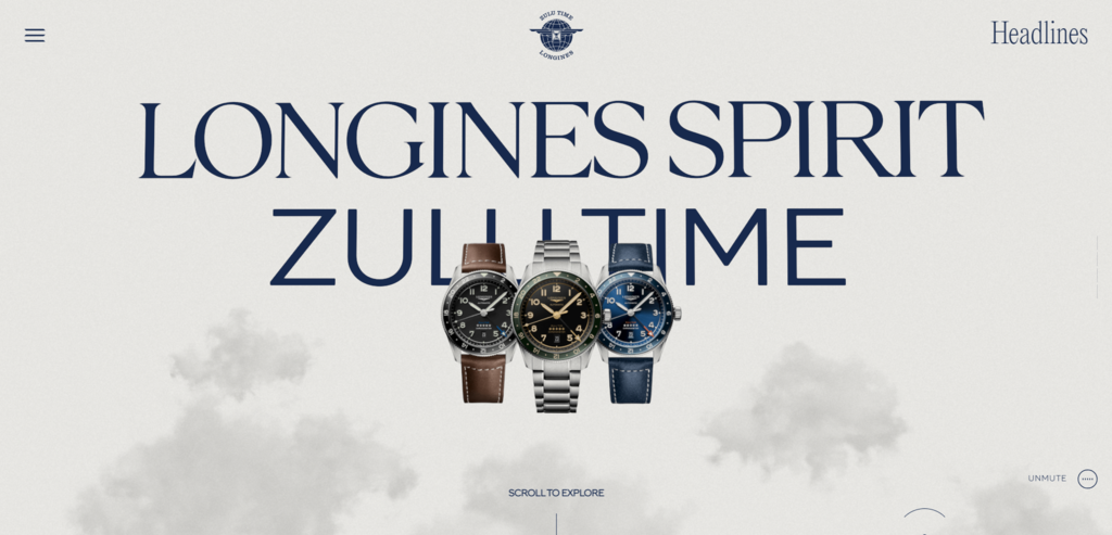
Longines is a luxury watchmaker with a long history, and this eCommerce website is a tribute to aviation pioneers who used the company’s watches in their campaigns.
Its interactive homepage reveals how the products’ cutting-edge features and durability help aviators from different generations adjust to time zones and travel in extreme conditions.
Best Design Elements:
- Scroll-triggered animations. Visitors will see moving objects, like planes and the world map, as they scroll through the homepage.
- Serif fonts. Using this font type in its headings and quotes maintains Longines’ elegant brand image.
- Interactive timeline slider. This unique element in the history page illustrates the company’s journey using a parallax scrolling effect.
Key Takeaways:
Luxury and classic brands should consider using serif fonts to convey sophistication and elegance. Also, integrate an interactive timeline to display the company history or project roadmap.
2. Potion
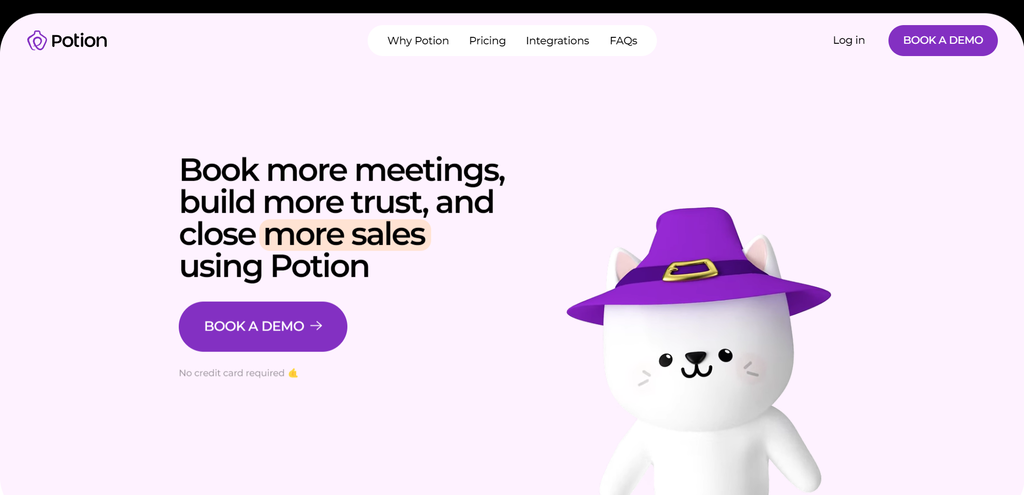
Offering video-making software, Potion’s digital storefront is modern and fun. It uses ample white space to direct readers’ focus toward elements like calls-to-action (CTAs). It also utilizes a pastel color palette with bright tones to emphasize certain words, images, and videos.
This online business website applies parallax scrolling and 3D animations to make the user experience (UX) more engaging.
Best Design Elements:
- 3D looping animations. Potion’s cat mascot uses claymorphism, a simplified version of three-dimensional elements resembling items made out of clay.
- Movable elements. The oval-shaped items on the integrations page are interactive. Readers can move, drag, and rotate these objects.
- Graphic Interchange Format (GIF). The usage of GIFs helps Potion grab the audience’s attention and communicate product benefits better than static images.
Key Takeaways:
Sell online services effectively by making your site’s interface engaging using interactive elements like animations, movable objects, and GIFs.
3. Help Scout
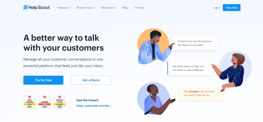
Help Scout is an excellent example of a good eCommerce site for business-to-business (B2B) companies.
The layout is straightforward and directly presents the product’s unique selling points. Its web design is also clean, with strategic CTA buttons and illustrated icons accompanying the copy.
Best Design Elements:
- Detailed menu items. Descriptions of the menu items inform what each topic is about, giving visitors added context to each web page.
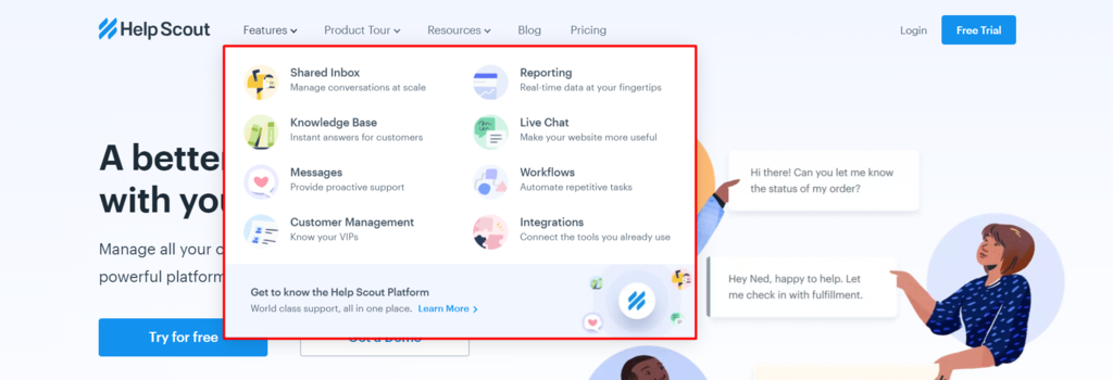
- Hover effects. Long product details can clutter a page, so Help Scout only shows them when users hover over specific icons.
- Social proof. This online business shows its awards, previous clients, and testimonials across the homepage to boost credibility.
Key Takeaways:
Add details to menu items and insert expandable product features to help visitors navigate your website clutter-free.
4. Bite Toothpaste Bits
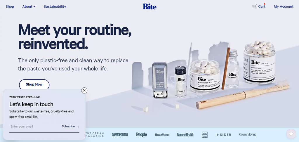
Bite’s online shop is one of the best examples of an effective eCommerce website. The beautifully-designed homepage grabs visitors’ attention and immediately communicates sustainability as one of its core values, which is also a popular eCommerce trend.
Best Design Elements:
- Expandable chatbox. A small speech bubble on Bite’s homepage is a great way to encourage visitors to reach out without intruding on their browsing experience. Instead, the icon subtly changes colors each second to grab attention.
- Strong messaging. Bite promotes sustainability across various web elements, including its subheadings and testimonials. This is an effective method to enhance the company’s overall branding.
- High-quality photos. This fantastic eCommerce site uses product images with intense sharpness and exposure, making them stand out against the soft pastel background.
Key Takeaways:
Communicate your product and brand values clearly to showcase what you stand for and attract relevant potential customers.
5. Black Star Pastry

Black Star Pastry’s online store has a fun and child-like web design, from the logo to typography and icons. Most of the elements use rounded corners, while simple illustrations accompany each sliding menu item.
Best Design Elements:
- Card menu items. This online store gamifies its homepage by displaying multiple cards as its menu instead of using a standard navigation bar or grid layout. To scroll through the cards, customers can drag and drop the cursor to the right or left, or click the arrows at the bottom of the page.
- Movable elements. The text and photos on the Locations and About Us page are draggable, adding a unique experience to the website.
- Illustration-like product images. This eCommerce website’s product images look like digital illustrations with high contrast and saturation, making them stand out against the black-and-white background.
Key Takeaways:
Gamify your eCommerce store to add interest and interactivity.
Suggested Reading
6. Zeuss
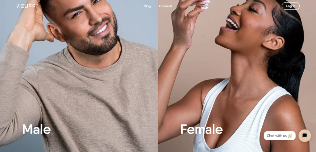
Zeuss sells personalized weight loss, hair, and skin care treatments. This eCommerce website utilizes a split-screen interface for its landing page with high-quality photos of models showcasing the product.
Best Design Elements:
- Clear navigation. With minimal distracting elements and sections dedicated to specific customers and products, visitors can easily find what they need.
- Horizontal scrolling. Each page has a combination of vertical and horizontal scrolling. The latter uses a Scroll button as a cue and shows Zeuss’ product benefits.
- Toggle headings. These enable Zeuss to build hierarchical sections and keep the site well-structured. Visitors can then expand each section for more information.
Key Takeaways:
Apply a split-screen layout if you are promoting a few key products to quickly direct consumers to the relevant web pages.
7. Make Architects
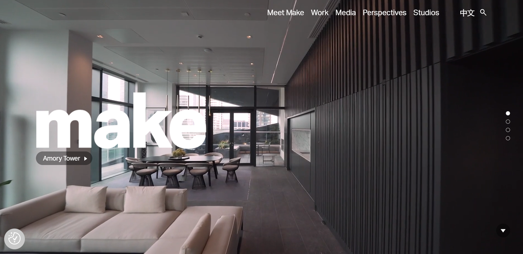
Make Architects offers architectural and interior design services internationally. Although we can’t classify this as a traditional online store, the company sells its services effectively via a captivating website design.
It uses an image-heavy layout to directly showcase the design team and past projects on the homepage. Overlaying the photos, Make Architects writes its value proposition and brief company history to attract visitors.
Best Design Elements:
- Background videos on the homepage. These are eye-catching and add movement to the site’s interface, making any eCommerce website stand out right away.
- Large images. High-quality and large photos of completed projects capture attention and provide a detailed look without users needing to zoom in.
- Step-by-step processes. Make Architects displays the entire project development process using sketches, videos, photos, and detailed descriptions, so visitors can fully immerse themselves in the company’s journey.
Key Takeaways:
Show your projects’ or products’ behind-the-scenes processes to increase transparency, enhance branding, and build trust.
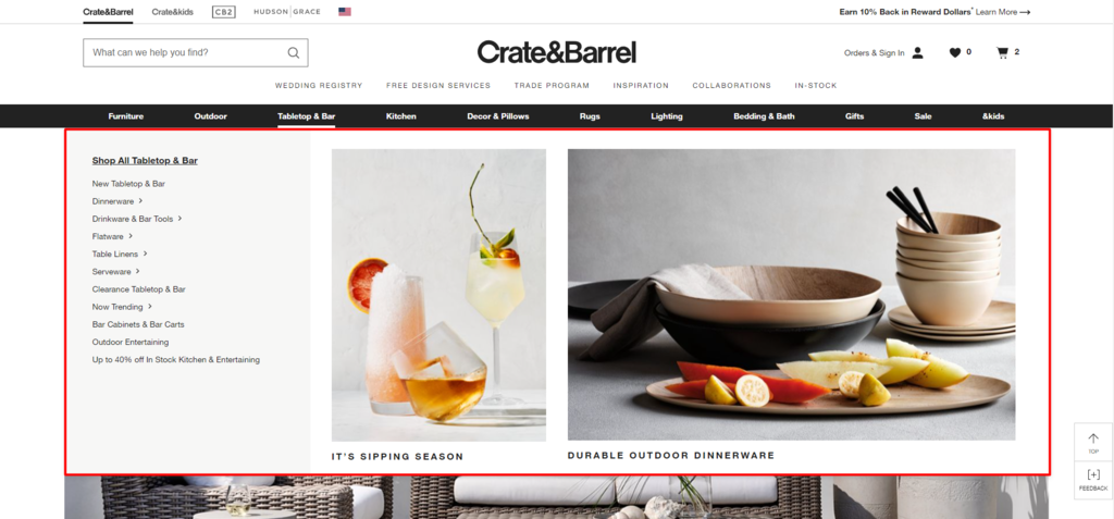
8. Crate & Barrel

Crate & Barrel sells home essentials and houseware, from furniture and kitchen appliances to decor and lighting. Founded in 1962, this eCommerce business establishes itself as offering sophisticated, modern, and high-quality homeware.
The company’s eCommerce platform reflects its branding with a light and clean interface. To help audiences navigate the store, it uses a mega menu and displays categories on the homepage, ensuring visitors can quickly find relevant products.
Best Design Elements:
- Images on the navigation menu. Besides having extensive menu categories, Crate & Barrel displays featured product photos to help users visualize the items.
- Breadcrumbs. To help users keep track of their current location within the website’s hierarchical structure, this eCommerce store puts breadcrumbs below the navigation menus and lists previously visited product categories.
- Detailed filtering and sorting options. Crate & Barrel has a comprehensive filtering system based on attributes like features, prices, and materials, so visitors can quickly discover specific items.
Key Takeaways:
Online stores offering many products should consider using breadcrumbs, a mega menu, and detailed filtering options to improve findability.
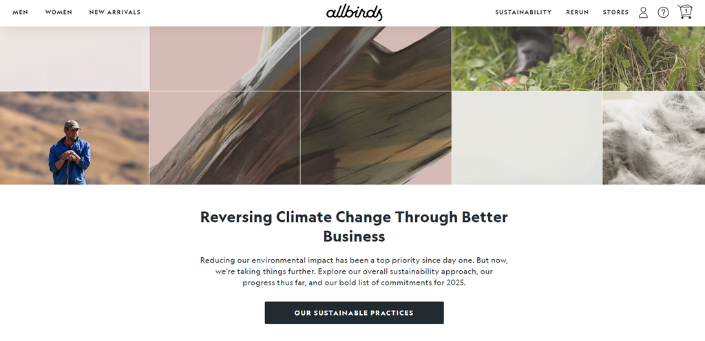
9. Allbirds
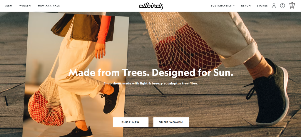
Allbirds’ online clothing and shoes store effectively reflects its values – simplicity and sustainability – from the headline and copy to the warm-toned editorial shots. It only takes a few scrolls on the homepage to read about the company’s sustainable practices and main product categories, like the newest collections and collaborations.
Best Design Elements:
- Informative product pages. Allbirds provides thorough product information, describing core features and materials, and includes close-up photos and videos to help customers visualize each product.
- Advanced review system. Below the product descriptions, Allbirds presents user reviews. It’s an excellent way to help visitors make purchasing decisions and enhance customer trust.
- Product recommendations. Allbirds shows related item recommendations across the site, including the checkout, product, and product category pages, to attract customers and increase conversions.
Key Takeaways:
Make your product pages as informative and appealing as possible to convert site visitors into customers. Using descriptive language and targeted keywords can also improve your eCommerce site’s search engine optimization (SEO).
10. Nike
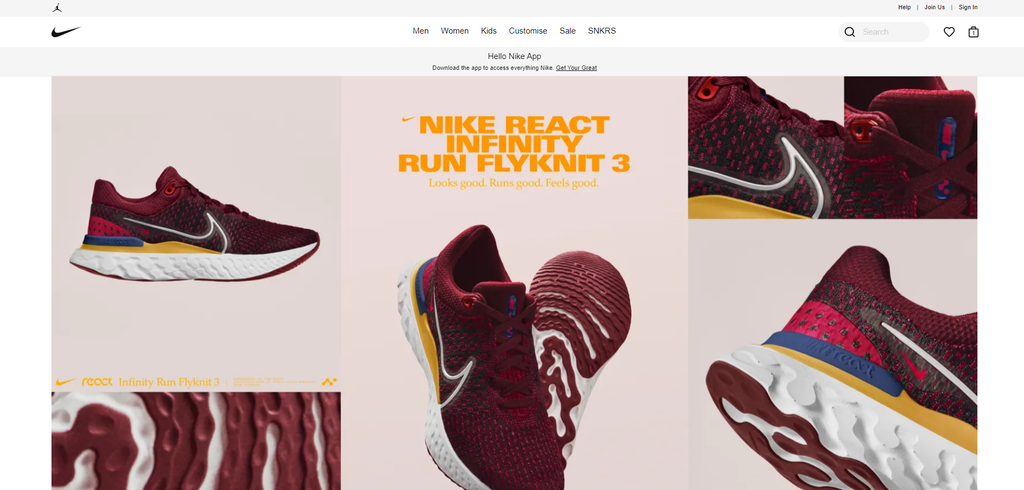
Another online fashion store that can be an excellent reference is Nike. From the navigation to filtering options, this brand’s eCommerce platform demonstrates the “less is more” principle well. It uses ample white space and image blocks with a plain backdrop, allowing the products to stand out.
Best Design Elements:
- Minimalist look. Simplicity in Nike’s eCommerce website eliminates distractions. This online store highlights large product images and maintains a black-and-white color palette.
- Guest checkout. Around 23% of consumers will abandon their shopping cart if they have to create a user account. To avoid this, Nike offers a guest checkout option, enabling shoppers to purchase without logging in.
- Comprehensive helpdesk. This streamlines the information flow, so customers can find relevant information without waiting for customer support.
Key Takeaways:
Sell online to a broad audience by enabling guest checkout for a faster purchasing experience and lower cart abandonment rates.
11. Frans Hals Museum
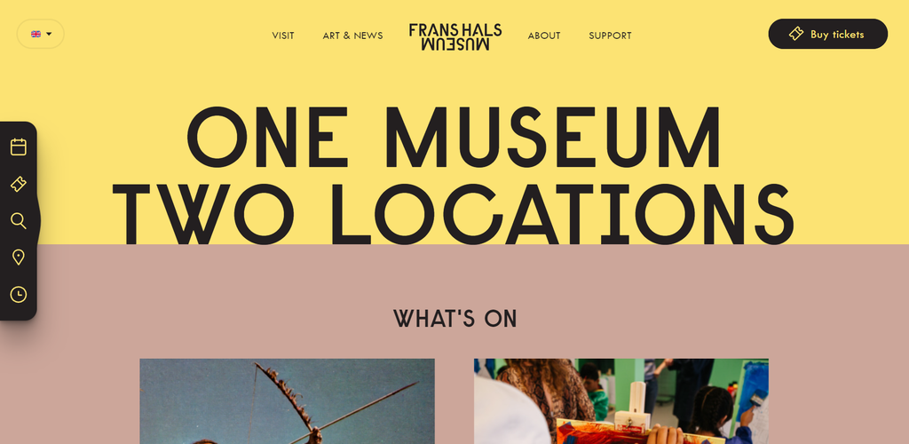
If you want to make a colorful eCommerce store, look at Frans Hals Museum’s site for inspiration. This website reflects the duality of the classic and contemporary, showcasing a collection of 17th-century art alongside modern pieces and colorful website design.
Best Design Elements:
- Bright color palette and transitions. This WordPress site uses a bright color palette with black text to maintain readability. To create a more dynamic user interface (UI), it also uses subtle transitions for pages, fonts, and images.
- Side navigation icons. It’s a handy feature leading users to the events page, ticketing page, location and opening hours page, and search function.
- Progress indicator. The numbers on the checkout page give users an estimate of how much longer the payment process will take.
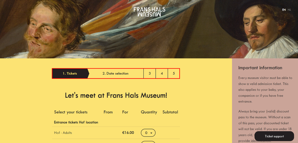
Key Takeaways:
Use a progress indicator to help visitors navigate multiple checkout pages. This breaks up lengthy forms into digestible sections, helping to ease the user journey.
12. The Scott Resort & Spa
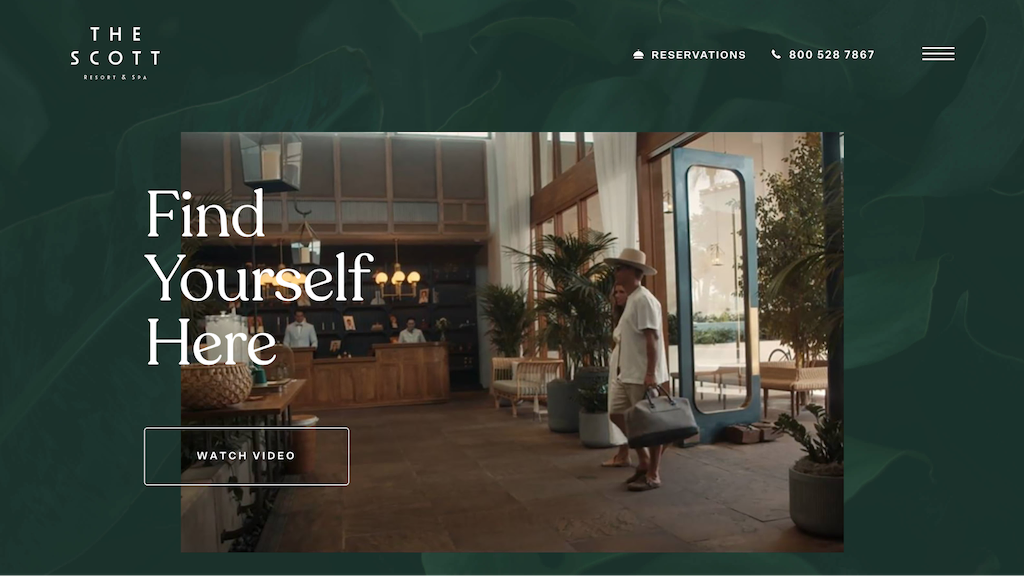
If you want to create an online store for an accommodation business, see The Scott Resort & Spa’s eCommerce website design for reference. This Arizona-based hotel channels a tropical holiday feel on its website using earth tones.
Best Design Elements:
- Details on the checkout page. Besides the progress indicator at the top of the reservation page, this WordPress site also lets customers review their bookings and offers different payment methods.
- Striking imagery. This eCommerce website uses imagery to sell its services and create a relaxing ambiance – from full-width galleries to looping videos.
- Full-screen overlay menu. Once visitors click on the hamburger menu, they’ll see a full-screen page showing links for different packages and offers. This approach saves space while providing visitors with clear navigation.
Key Takeaways:
Avoid overused stock images and invest in professional photography to showcase your products and services and strengthen your branding.
13. uMake
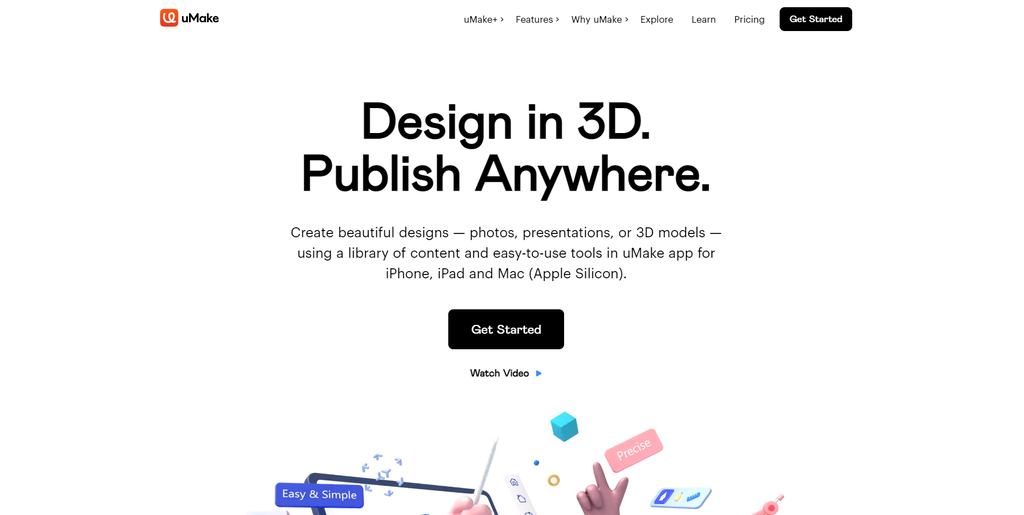
uMake is a great reference for a modern eCommerce website design. As a 3D software company, it applies 3D illustrations across the website, effectively grabbing the audience’s attention and delivering its product’s value proposition.
Best Design Elements:
- Hero shots. uMake uses short videos for each featured section on the homepage to demonstrate how the software works.
- 3D elements. To match its main selling point, uMake uses 3D graphics for its icons, thumbnails, and hero images.
- Glassmorphism. This is a popular UI trend where designers place crisp lines on top of a glassy blur, creating a semi-transparent element and modern look. uMake applies this style on the sticky navigation bar and some hero shots.
Key Takeaways:
Consider using 3D graphics to achieve a modern eCommerce design and combine them with trending UI elements, like glassmorphism.
14. Vitra
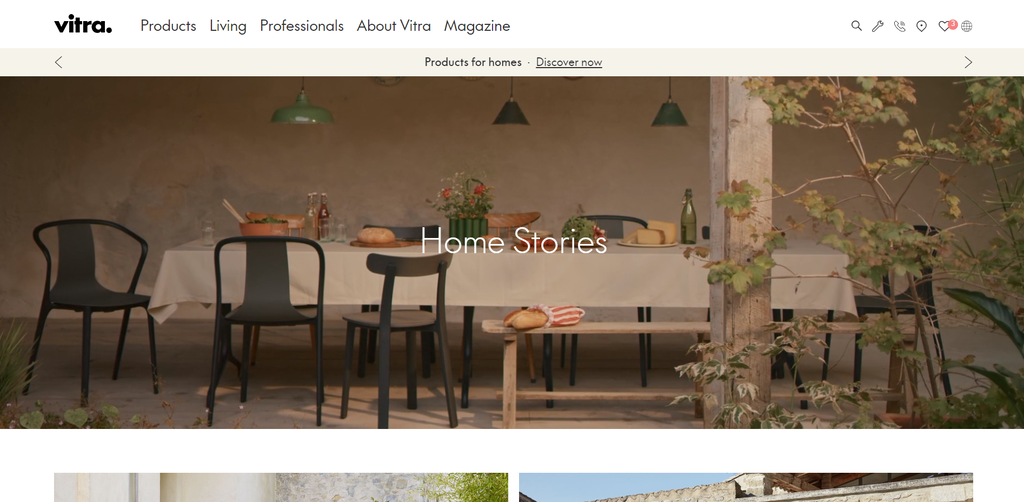
Vitra is a Swiss furniture company for work and living spaces targeting businesses and individuals. To help users navigate the products, it divides the website menus into specific niches – for professionals or homeowners – and makes the featured homepage images clickable.
Best Design Elements:
- Quiz. Vitra has a tool called Find My Vitra to help consumers discover the perfect office chair for their needs by answering a few simple questions.
- Shoppable pictures. eCommerce website visitors can add a product from the editorial photos to their wishlist by clicking on Shop the Look.
- Well-designed loading page. Waiting for pages to load can frustrate visitors. To alleviate this, Vitra displays a loading progress illustration on certain pages.
Key Takeaways:
Understand the possible challenges audiences may face when purchasing your product. Consider creating eCommerce features and tools like product quizzes and shoppable images to help solve them.
15. Display
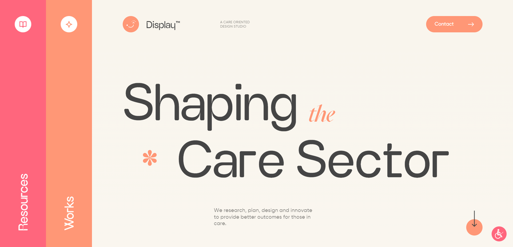
Display is a digital agency working with service providers in the disability sector. Its eCommerce website also promotes web accessibility and inclusivity by integrating warm tones, accessibility features, and subtle animations.
Best Design Elements:
- Accessibility features. This eCommerce website has customizable accessibility tools so users with disabilities can confidently navigate and interact with it. For example, you can optimize for screen readers and change the color saturation.

- Big navigation menus and transitions. Display has big vertical navigation menus that smoothly transition from either side of the web page whenever visitors click.
- Illustrations. The subtle graphics on this studio’s homepage add movement and color to this otherwise simple eCommerce platform design.
Key Takeaways:
Make your website accessible and ensure it has a smooth UI to accommodate diverse audiences.
16. Mack & Pouya
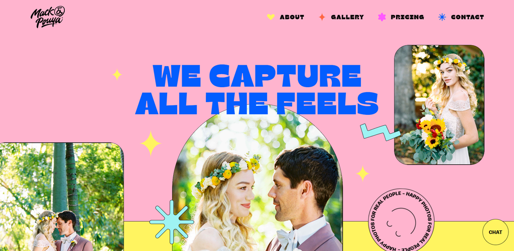
Photographers can check out Mack & Pouya’s eCommerce website design for inspiration. Built with Webflow, an eCommerce platform offering complete customizability, this one-page website explores various design features like interactive elements and animations.
Best Design Elements:
- Bright color palette. Many photography websites prefer a minimalist look, but Mack & Pouya stands out by using colorful tones.
- Calculator. This eCommerce website provides an interactive calculator to help customers personalize and estimate package prices. It’s a great marketing tool, and users can customize the total service hours, add-ons, and location.
- Interactive galleries. Mack & Pouya uses GIFs and a moving slideshow to present its past projects and make the online store more engaging. The images respond when users hover or click on the photos.
Key Takeaways:
Research eCommerce websites in your industry and create a unique website design with relevant marketing tools to stand out.
17. Zenni
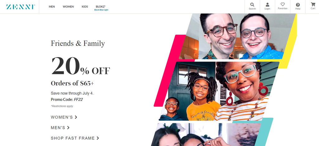
As a pioneer in the eyewear industry, Zenni brings a unique experience to its potential customers. This business-to-consumer (B2C) company has a few stand-out features helping users find the perfect eyewear, such as a virtual try-on tool.
Best Design Elements:
- Virtual try-on. This technology uses augmented reality (AR) and lets customers use their own devices to see how the glasses look on before purchasing the product.
- Categories on the homepage. Zenni’s landing page displays its full range of products, from protective eyewear to reading glasses – giving visitors an overview of the entire site without needing to click on the navigation menu.
- Search button. Besides making the search bar easy to spot, this online store provides autocomplete suggestions with images. For example, when visitors type “kids,” it displays product images under the Kids category.
Key Takeaways:
Online stores selling shoes, apparel, and accessories can use virtual try-on technology to satisfy shoppers who can’t touch or test the products while online shopping.
18. Heveya
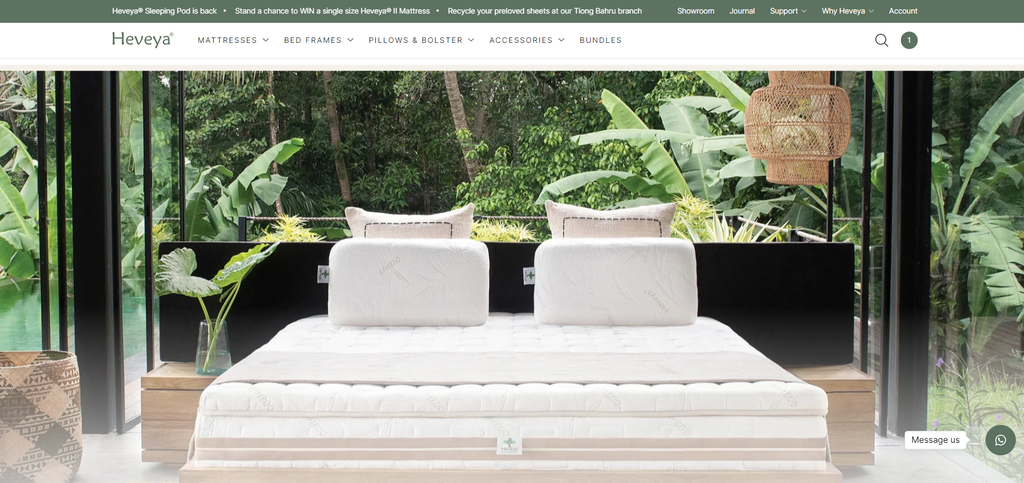
Heveya is an excellent eCommerce store example for home decor businesses wanting to sell online. It provides tour videos of its offline stores and has a virtual 360-degree showroom to deliver a digital in-store experience.
Additionally, this online store applies a multichannel selling and marketing strategy by linking to its Instagram and Facebook pages for visitors to access certain features.
Best Design Elements:
- Virtual showroom. This eCommerce store offers immersive digital spaces with 3D product displays. It also has several buttons integrated into the virtual tour containing product videos or links leading shoppers to a product page.
- Shop the Story section. Over 50% of people make a purchase after reading a company’s blog post. Heveya maximizes this opportunity by displaying mentioned products at the end of each article.
- Compare products. Shoppers may become confused by many product variations. To help customers make the best decisions for their needs, Heveya provides a comparison table so users can see multiple items’ features at a glance.
Key Takeaways:
Some consumers may be hesitant to shop online, so offering a digital brick-and-mortar experience with advanced marketing tools like augmented reality can be worth the investment.
19. Notebook Therapy
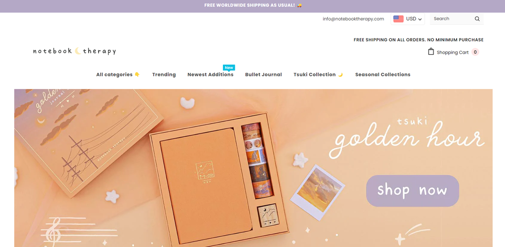
Notebook Therapy is an eCommerce business selling Korean and Japanese stationery. Since the company is known for its cute designs, this Shopify-built website mostly plays around with pastel images and illustrations to stay consistent with the product branding.
Best Design Elements:
- On-brand visuals. From simple hand-drawn illustrations to sticker-like thumbnails, Notebook Therapy’s eCommerce store stays consistent with its brand personality and products.
- Emojis. This eCommerce business uses emojis across the site, including for the promotional banner, menu items, and headings. This demonstrates the brand’s fun approach and friendly attitude that matches its target audience.
- User-generated content (UGC). Notebook Therapy displays photos from its Instagram followers. This type of content serves as social proof and can promote authenticity 2.4 times more than content produced by brands themselves.
Key Takeaways:
Understand your brand personality and target customers, and apply relevant elements to your eCommerce site. Play around with emojis and designs to evoke certain feelings so the audience can identify with your eCommerce platform.
20. 5S
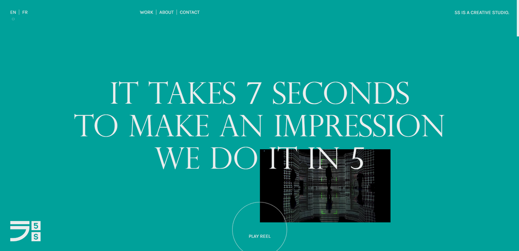
5S is a Canada-based creative studio specializing in content creation. Its eCommerce website gives a great first impression – combining a big headline in a striking serif font, auto-play videos, and a sticky scrolling effect pulls audiences in.
Best Design Elements:
- Color palette changes. Every time visitors click on the background or refresh the site, the entire website’s color palette will change. There are five color combinations, and this user-triggered feature adds a cool touch to the modern design and abstract layout.
- Layering animations. This studio adds subtle animations with a layered effect. For instance, the video content is hidden behind the text at first, then moves in front of the text when users scroll.
- Quickview. Visitors can play the promotional videos on mute by hovering the cursor over them.
Key Takeaways:
Incorporate a unique scrolling experience and user-triggered features to enhance the website design and add personality without being too distracting.
21. Boost

Boost sells a multivitamin product aiming to improve customers’ immune systems. Its online store is an excellent representation of its branding, from tone, language, and style to personality.
It uses a bright orange color palette and punchy copy, reflecting the energy that the company wants visitors to feel when they enter this great eCommerce website.
Best Design Elements:
- Hero typography. A typographic hero image is one of the most popular web design trends this year. This helps Boost showcase its bold style and marketing approach.
- Vibrant color and copy. The multivitamin’s core purpose is to boost people’s immunity, and the web designer shows it through bright colors and no-nonsense copy.
- Animations. As visitors scroll down, the animated vitamin bottle moves to the center and rotates to show the product information. This detail makes for a fun and engaging UX.
Key Takeaways:
Start selling online by keeping your online store up-to-date with the latest eCommerce website design trends to prevent the site from looking outdated.
22. AYO
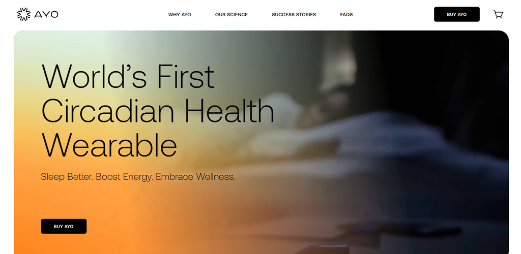
AYO is an excellent reference for modern eCommerce stores in the health and technology sector. This company focuses on showing the benefits of its science-driven products with a contemporary site design.
Best Design Elements:
- Gradient. Color gradients are a popular web design trend, and AYO integrates this element well on its website, such as for the background, icons, and fonts. This style adds more depth to a web page and helps direct visitors’ focus.
- Background changes. AYO’s products are meant to boost customers’ circadian health. To illustrate the benefits, the designer uses both light and dark backgrounds to symbolize how the product can help ease people’s days and nights.
- Effective CTAs. AYO encourages users to navigate web pages across its eCommerce store by using copy like “Discover AYO Science.”
Key Takeaways:
Enhance website browsing time by using copy that’s customized to the brand’s value proposition.
23. Pitch Tents
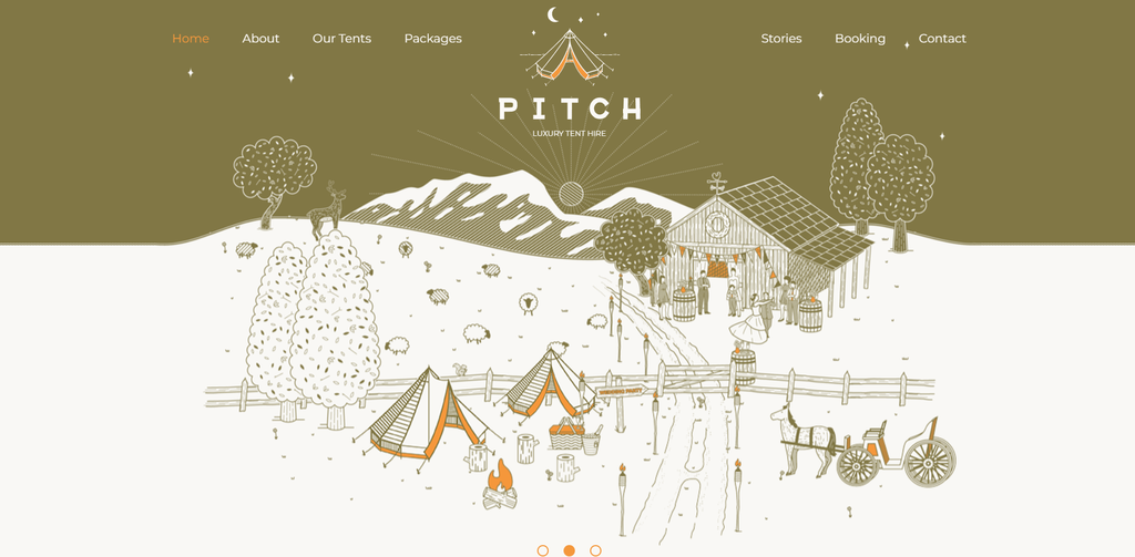
Pitch Tents is a London-based company providing a luxurious camping experience, known as glamping, across the UK.
Using the leading eCommerce platform, WordPress, this company has complete freedom to customize the site design. The online store features sophisticated illustrations to visually sell its services and evoke a spirit of adventure.
Best Design Elements:
- Illustrations. Pitch Tents personalizes its own eCommerce website and strengthens the product storytelling using cartoon images of the glamping experience.
- One-page checkout. Pitch Tents’ singular booking page contains all the elements of a standard checkout process, including the selected package and contact details. Reducing the number of pages and clicks to complete a payment can quicken conversions.
- Back-to-top button. Located at the end of each web page, this lets visitors jump back to the top of the page with a single click.
Key Takeaways:
Use custom illustrations when a photograph can’t fully capture your unique selling point. It’s also an excellent solution if you want to have a different look and feel from photo-focused eCommerce websites.
24. Flyers
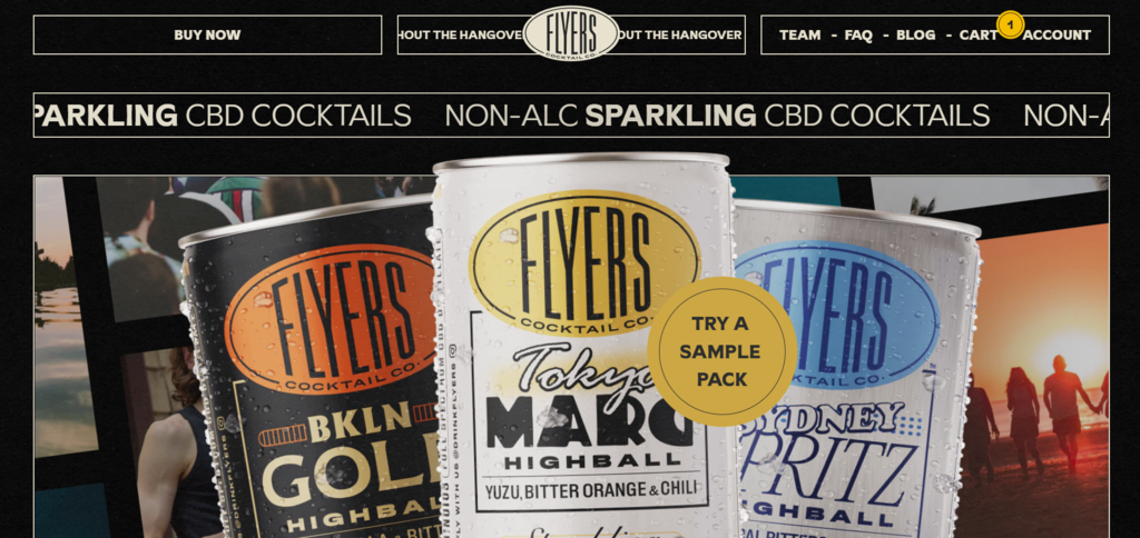
Flyers sells CBD cocktails and shows its three products directly on the homepage. This eCommerce site was a nominee for Awwwards thanks to the well-designed landing page with various animations.
Best Design Elements:
- Retro style. This web design evokes nostalgic feelings of a summer holiday that matches the product’s target audience.
- Interactive CTA buttons. Some CTAs on this website, like the Try a Sample Pack and Shop Now buttons, trail users’ cursors throughout the page.
- Moving text. This small business lists its product features in a horizontal moving text to capture readers’ attention.
Key Takeaways:
Brainstorm your branding strategy before building your online store to deliver a marketable customer experience.

25. Grainne Morton
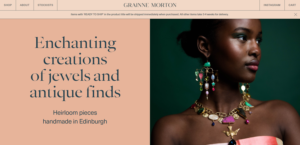
Grainne Morton is an excellent example to follow if you want a simple site that can still stand out from the crowd. It uses linework with an earth-toned palette to create a grid layout that highlights the product photos.
Best Design Elements:
- Linework. This web design uses visible grids to break up sections and make the page content scannable without feeling cluttered. Grainne Morton puts images and text in rectangles to separate headlines, product photos, and menu items.
- Instagram feed. This brand displays its Instagram feed on the homepage to encourage visitors to follow and build engagement.
- Side shopping cart. When customers add a product to the bag, their virtual shopping cart will appear as a sidebar. This helps users quickly review their items without having to visit another page.
Key Takeaways:
Integrate a pop-up shopping cart for a seamless shopping experience.
Need More Design Inspirations?
Check out our list of the 20 best website design inspirations to spark design inspiration for your project.
What Makes a Great eCommerce Website Design?
From the examples above, it becomes clear that designing a website for eCommerce isn’t only about aesthetics – it is also about the overall UX.
This section will cover the top six eCommerce features every business owner needs to consider when creating a new online store or revamping their existing website.
1. Clear Online Store Navigation
Here are some key elements of user-friendly online store navigation:
- Self-explanatory menu items. Use familiar labels for your menus like Home, Product, Blog, and Contact to make navigation intuitive. If you have many categories, consider using a mega menu like Crate & Barrel to let shoppers see different options at a glance.
- Easy-to-find search bar. The best placement for a search bar is either at the top-right or top-center of a web page. For better ease of use, add autocomplete suggestions like Zenni.
- Informative footer. A footer can be helpful for visitors trying to navigate through essential information like shipping, return, and refund policies.
- Comprehensive filters. Improve your product findability using price, color, and sort-by filters.
- Breadcrumbs. These act as navigational aids to inform visitors where they are on the site. It also helps Google understand your site structure better.
2. Seamless Shopping Cart and Checkout Process
A complex checkout procedure is one of the primary reasons for cart abandonment. Therefore, simplifying the process is vital to boosting sales and the overall UX.
For optimal performance, place the shopping cart icon in the upper-right corner and display the number of items in the cart to help visitors keep track of their potential purchases.
If you visit Zenni, for instance, the shopping cart icon is gray when the cart is empty but turns turquoise and displays the number of items once customers add products. You can also use Grainne Morton’s detailed pop-up shopping cart as a reference.
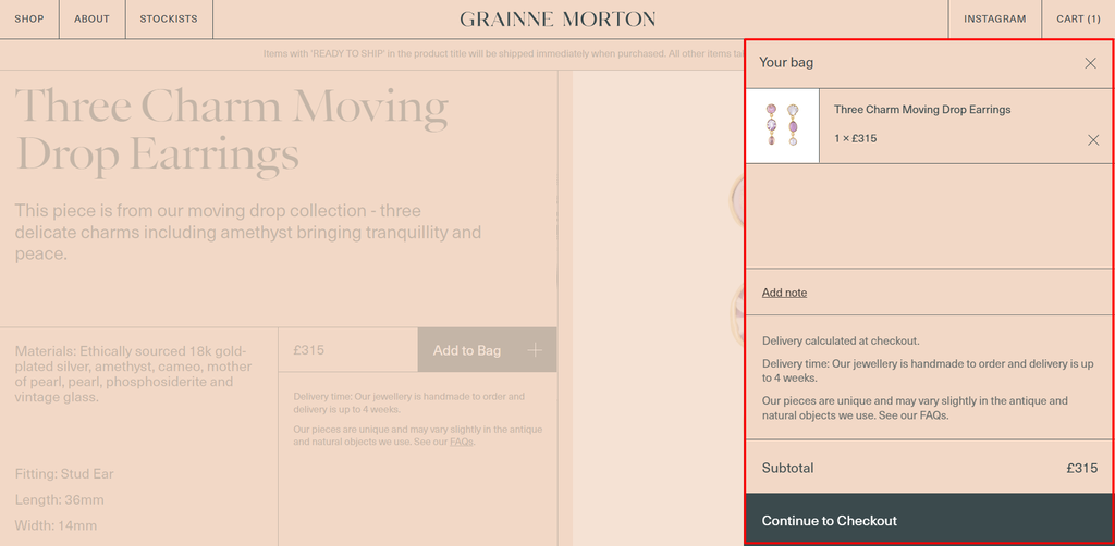
Consider also adding a progress bar on the checkout page like Frans Hals Museum if you have a multi-page payment completion process. Alternatively, use a single checkout page like Nike to simplify the shopping experience.
3. Consistent Online Business Branding
Brand consistency means ensuring that your brand values, identity, and messaging are uniform across all channels. Statistics show that people tend to remember a brand after five to seven impressions, so maintaining cohesive messaging can help boost brand awareness.
Here are some essentials to building a successful brand:
- Have clear business goals and values.
- Create a memorable brand name and custom domain.
- Maintain the brand’s voice and tone.
- Present consistent visual elements, including logos and color palettes.
To start branding your online business, specify your target audience during the initial eCommerce website development stages.
For example, Allbirds’ potential segments include millennials and Gen Z who enjoy the outdoors. This helps the company position itself as an environmentally friendly brand focusing on sustainability.
Another useful tip is to research your competition. To have a strong online presence, develop a unique brand strategy compared to other small businesses in your industry. For example, Mack & Pouya uses bright colors on its online store while most of its competitors integrate minimalist styles.
4. Readable and Engaging Content
Research shows that users read only 20-30% of the text on any web page. Mostly, visitors simply scan the site to look for crucial information. That said, making scannable content is important for a good eCommerce experience.
Break up the website content into an easy-to-scan format by:
- Keeping the paragraphs and sentences short.
- Highlighting important information with bold fonts.
- Integrating bullet lists to avoid large blocks of text.
- Using images in your content.
Helpful tools like Readable and Grammarly can check the length of your sentences and language style to ensure readability.
Additionally, consider using interactive content – take the quizzes on Vitra’s online store and 360-degree experience on Heveya’s eCommerce website as examples. This type of content can enhance conversions to 40-50% and social shares by 28%.
5. Mobile-First Online Shopping
Almost 80% of customers have made a purchase online using their mobile devices, and Google also prioritizes mobile-friendly sites on its search engine results pages (SERPs).
So, not only is having a mobile-friendly website crucial to improve your store’s UX, but it is also essential to boost the site’s SEO.
The first step to delivering a smooth mobile commerce experience is to use a responsive template or theme on any eCommerce platform you use. Mobile-friendly eCommerce website templates will adjust to any device, so you won’t have to worry about creating a separate site for mobile users.
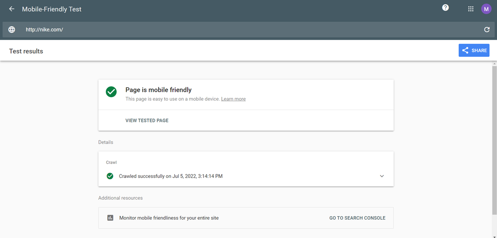
Before selecting a design template, check the theme description to see if it has a demo page. Copy the page’s link and paste it on Google’s Mobile-Friendly Test to determine its responsiveness.
Additionally, make sure all website elements like CTA buttons, forms, and navigation menus are touchscreen-friendly by adjusting the sizing, spacing, and shapes.
6. Transparency and Security
Without proper eCommerce security, hackers can divert payments and steal credit card details from online stores. This can contribute to significant losses in revenue and reputation as over 40% of shoppers will stop buying from an online store if it experiences a data breach.
Large enterprises and small businesses alike should ensure to:
- Purchase an SSL certificate on the website.
- Provide a secure payment gateway system.
- Be transparent about customer data collection.
Check the data privacy laws applicable to your target audience’s region. For example, the European General Data Protection Regulation (GDPR) directly impacts data collection for businesses targeting customers in the EU.
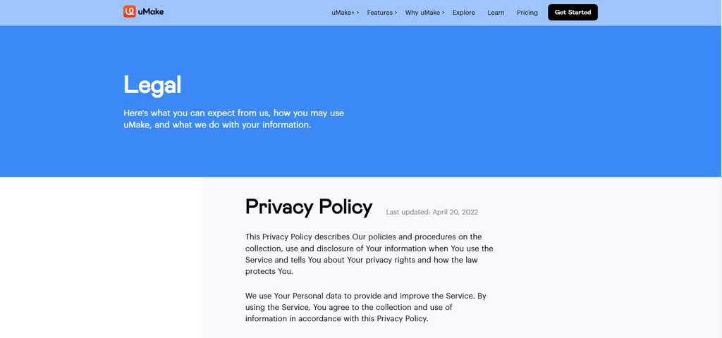
uMake is a great example of an eCommerce business displaying data collection transparency. It provides links within the website footer explaining the privacy policy and terms of use. The site also has detailed and scannable information about how the company keeps users’ personal information safe.
Conclusion
A well-designed eCommerce website is a great place to start selling products and services. Online businesses can better personalize the features and designs on their own sites rather than on existing eCommerce platforms like marketplaces.
In this article, we provided 25 real-life web design examples to inspire you. We also covered some practical design tips to implement on your own eCommerce website.
The eCommerce stores listed today are an outstanding balance of creativity and usability. The companies integrate consistent branding while keeping their sites user-friendly with clear navigation and good mobile responsiveness.
If you’re just starting your eCommerce journey and want to launch your own online platform, feel free to browse our comprehensive list of online business ideas and check out our step-by-step guide to starting an online store.
eCommerce Websites FAQ
Find answers to the most common questions about eCommerce website design.
Is eCommerce Profitable?
Yes, it is. In 2021, the global online shopping market reached over 2.14 billion people. Coupled with fast growth, the eCommerce industry is forecast to grow from around $3 trillion today to $5.4 trillion in 2026.
Which Is the Best eCommerce Website?
Some of the best sites to sell online include Amazon and eBay. These eCommerce platforms give your online store instant reach to millions of users. However, consider creating your own eCommerce website if you want complete control over the features and designs.
What eCommerce Platform Should I Use?
There are different eCommerce platforms to choose from, each offering unique features. Therefore, the best eCommerce platform will depend on your needs, resources, and business goals.
For example, choose a website builder like Hostinger if you’re a beginner or small business owner wanting to create an online store in just a few clicks. Meanwhile, the best eCommerce platform for dropshippers is Oberlo due to its all-in-one inventory management system.
What Are the Best Ways to Find Customers?
Building your network via word-of-mouth marketing is the fastest, cheapest way to get more clients. If you want to take it a step further, consider experimenting with content and email marketing. You can also sell products on online marketplaces to reach a broader audience.

Lidin is passionate about online business and marketing. She believes that these topics should be accessible to everyone, so she is determined to help people unlock their digital potential through written pieces. Outside her working hours, Lidin enjoys exploring new cities and editing videos.

Hasna is passionate about tech, culture, and the written word. She hopes to create content that helps people succeed on the web. When not writing, rearranging, or polishing sentences, she enjoys live music and overanalyzing movies.

Comments
June 24 2020
Hi Paulius Zunda Thanks for sharing these fantastic eCommerce website design examples. This article is really helpful for us!!
September 10 2020
amasing e-commerce website design example,by using your guideline geven here, anyone will make a wonderfull website.
April 05 2021
Great, Your tutorial is awesome. Thanks for sharing with us.
March 15 2022
Last time I hired developer he developed my business ecommerce site using cms call Shopify but I was not satisfied with his work or maybe the cms didn't provide me what I wanted. Do you have suggestion related best cms for small business ecommerce site? Thanks
March 16 2022
Hi! I would always suggest to go with an open-source CMS rather than a builder - this gives you some freedom to change hosts with no issues in case you decide to move your business away from them. We have a nice selection of eCommerce platforms here, but my personal favourites would be PrestaShop, WordPress + WooCommerce or Magento (though Magento is best suited for bigger websites).
May 13 2022
That's amazing. It will help a lot to get an idea of how should an eCommerce site should be.
May 18 2022
Thanks for sharing these fantastic eCommerce website design examples.
January 08 2024
By using your guideline given here, anyone will make a wonderfull website. Your tutorial is awesome. Thanks for sharing with us.
January 10 2024
Thank you for your kind words! Should you have any further questions or need assistance, please don't hesitate to reach out ?