How to Use CSS Breakpoints for Responsive Design, Most Common Media Breakpoints + Tips
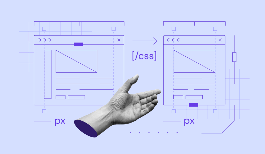
CSS breakpoints are values that determine how a website looks on different screen sizes. When visitors’ devices reach their breakpoints, the website content responds and adjusts accordingly.
These breakpoints, together with CSS media queries, are responsible for a responsive website design. In short, they make your website look proportional when viewed on a different screen size.
In this article, we’ll show you how to implement CSS breakpoints for your site. You will also get tips on how to use breakpoints for a responsive web design.
Download glossary for web beginners
What Is a CSS Breakpoint?
A CSS breakpoint is a value that determines a website’s size and layout across different screen sizes. It creates a responsive website design when implemented with a CSS media query.
A breakpoint’s value is set based on the user’s device height or width. While it is typically shown in pixels, breakpoints can also use CSS units like em, rem, or percentages.
With breakpoints and media queries, you can define different conditions and adjust your site content based on them. For instance, you can show the navigation bar only on large devices.
To apply breakpoints and media queries, you can only use an external CSS type. To do so, you must create and link a stylesheet to your site’s HTML file.
How to Set CSS Breakpoints
There are two ways of setting CSS breakpoints – based on the device or site’s content.
Suggested Reading
Before proceeding, check out our CSS cheat sheet if you are unfamiliar with the styling language.
How to Use Breakpoints Based on Device
Breakpoints can use the device’s width and length as the parameters, typically shown in the pixel values. Here’s an example of them:
        /* Portrait iPhone 6 to 8 */
@media only screen
and (min-width: 375px)
and (max-width: 667px)
and (-webkit-min-device-pixel-ratio: 2)
and (orientation: portrait){
...
}
However, determining device-based breakpoints might be tricky since their screen resolutions vary. It is also time-consuming since developers must add CSS breakpoints every time a new device is released.
Instead of setting a breakpoint for specific devices, you can group them based on resolutions. Here’s the code example:
/* Small devices (portrait tablets and large phones, 600px and up) */
@media only screen and (min-width: 600px) {...}
/* Medium devices (landscape tablets, 768px and up) */
@media only screen and (min-width: 768px) {...}
/* Extra large devices (large laptops and desktops, 1200px and up) */
@media only screen and (min-width: 1200px) {...}
While it’s possible to set breakpoints only for popular devices, we don’t recommend it since your target audience may use various devices.
How to Use Breakpoints Based on Content
You can set your breakpoints based on your site’s content. As a result, you won’t need to add a new breakpoint whenever a device comes out, saving time and keeping your site code clean.
With this method, you add breakpoints on the positions where the content starts to look misaligned or distorted when rendered on a different screen size.
You can set the parameter in two ways – using a minimum width pixel value or range. For example, the following will run the CSS code for devices with a min screen width of 720 pixels:
        @media only screen (min-width: 720px){
...
}
Meanwhile, the following applies if the device width is between 720 and 1280 pixels:
css]@media only screen and (min-width: 720px) and (max-width: 1280px){
…
}[/css]
How to Use min-width or max-width CSS Breakpoints
Additionally, you can set breakpoints using a specific value with min-width, max-width, or both to define a range. Each of them is ideal for a particular use case.
Use min-width breakpoints when developing a website with the mobile-first approach. It means you set the default CSS for the smaller screen and adjust it for larger devices.
Conversely, when developing for larger devices, use max-width breakpoints and rearrange your website for smaller screens. Use both only when you are particular about your site’s appearance on a certain device.
Pro Tip
In addition to screen adjustment, you can use breakpoint with other media queries like print and speech.
Media Query Breakpoints
To set your media query breakpoints, determine what devices visitors use to render your website. They may use computers, tablets, or mobile phones.
The common breakpoints for these devices are based on their resolution. Some of the most popular ones are 1920×1080, 1366×768, and 360×640.
Alternatively, you may use different frameworks’ breakpoints. Since they are optimized for the mobile-first approach, use them as references when developing for larger-screen devices.
Here are a few examples of popular frameworks with their breakpoints:
- Bootstrap – 576px, 768px, 992px, 1200px, and 1400px.
- Foundation – 640px, 1024px, and any size for smaller devices.
- Bulma – 768px, 769px, 1024px, 1216px, and 1408px.
Tips for Using CSS Breakpoints for Responsive Design
Consider the following tips when using CSS breakpoints to ensure your website’s responsiveness.
Minimize HTML, CSS, and JavaScript
Minifying your site code helps improve your site responsiveness by removing unnecessary characters.
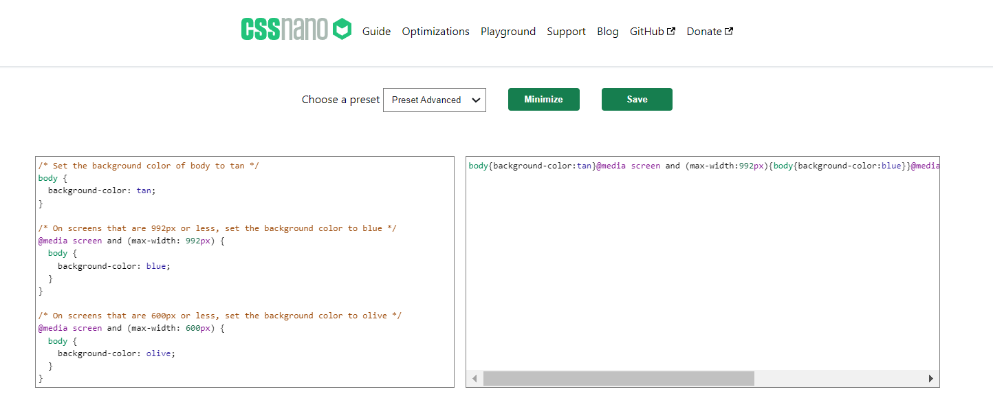
Simpler code runs more efficiently, allowing your site to adjust its layout more quickly. It is especially beneficial if your site uses multiple breakpoints and CSS media queries.
Prioritize Mobile Devices
When designing a website, set your default styles for small devices and adjust them for bigger screens. It ensures your website is mobile-friendly and responsive across different devices.
Prioritizing mobile devices also helps simplify the development process since designing for smaller screens is more complicated.
Simplify the Mobile View
In addition to resizing, simplify your website for a mobile view. It helps improve your page’s loading speed and usability across different platforms.
To optimize your website for mobile viewing, remove unnecessary content and rearrange its navigation. Use breakpoints to allow the site to hide and reposition those elements automatically.
Name Your Ranges Sensibly
Your breakpoints ranges should be descriptive and easy to understand. Ideally, the range should specify the device’s type and orientation, like “portrait iPhone X.”
For device groups, use names that describe their screen sizes, such as “medium landscape tablets” or “large portrait smartphones.”
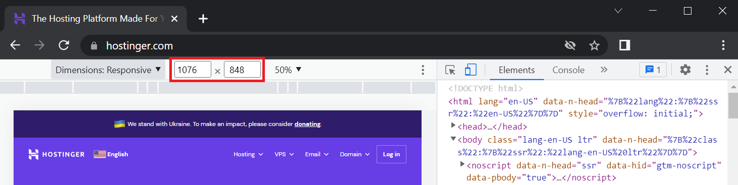
Use DevTools to Enter Large Numbers on Larger Screens
You may need to create a breakpoint for screens larger than your device. In that case, use Google DevTools’ Toggle Device Toolbar feature to simulate how the breakpoints look on different viewport sizes.
To access it, open Google Chrome’s inspect element and find the phone and tablet icon. At the top, you will see dimension fields where you can enter a custom screen resolution.
Conclusion
CSS breakpoints determine a website’s size and layout on different screen sizes. They work with CSS media queries to allow your site to adjust itself according to users’ devices.
You can set breakpoints based on the device’s screen size or the website’s content. We don’t recommend the former since you must add more lines of code whenever new devices come out.
To set your breakpoint, define the target device’s screen min and max width. Alternatively, use the ones that the web development framework provides, like bootstrap breakpoints.
When it comes to ensuring your website is fully responsive, don’t forget to minify your site code, name your ranges sensibly, and use the mobile-first approach.
Besides setting CSS breakpoints right, remember to choose a suitable web hosting service to ensure your site is accessible and works fine.

CSS Breakpoints FAQ
In this section, we’ll answer some common questions about CSS breakpoints to help you understand them more.
Can Breakpoints Use Pixels, Ems, or Percentages?
Yes, you can use pixels, ems, and percentages. Min and max-width breakpoints also support different property values like cm, mm, and pt.
Which CSS Unit Is Best for Responsive Design?
Relative units like percentages are ideal for responsive design as they can adjust based on the parent element.
Which CSS Breakpoints Should You Use With SASS?
With SASS and SCSS, use the @mixin breakpoint. It allows you to create more declarative breakpoints that are easier to reuse throughout your website.

Aris is a Content Writer specializing in Linux and WordPress development. He has a passion for networking, front-end web development, and server administration. By combining his IT and writing experience, Aris creates content that helps people easily understand complex technical topics to start their online journey. Follow him on LinkedIn.